Thursday, 31 January 2013

Ski App - Photos on Flickr


I have uploaded a selection of my photos from Canazei to Flickr. I will use quite a few of these in my app, although I haven't finalised exactly which ones yet. It really is a stunning place to ski, just take a look:

http://www.flickr.com/photos/71119288@N08/

Wednesday, 30 January 2013

Ski App - Branding

After a bit of playing around I have settled on the name "INSIDE TRACK" for my ski app. The first one will be Inside Track: Canazei, with other resorts to follow. The name makes sense to me, because the app is about getting the real local knowledge from the people in the resort, plus I have a pretty good idea for the logo, using a pair of curving ski tracks for the S. Something like this:


The font I am using is the rather lovely T-Star Pro Bold, which I will use for all the section headings in the app.

Tuesday, 29 January 2013

Ski App for iPad - Initial Research

I have decided to make a beautiful iPad magazine app about Canazei, the ski resort I visited last week. I did quite a lot of in-depth research, finding out all the stuff that it would be really useful to know before a trip, the things you are unlikely to find in a regular travel guide. Some of the content will be from my own observations, with the rest made up from interviews with chalet staff and other locals. The final app can than be used as a template for other ski resorts.

I will show the app to the major UK tour operators, such as Crystal, Thomson, Inghams and Neilson, with the suggestion that they could send a link out to their customers at the time of booking, so they can bone up on the area they are visiting before they go. I would have found such an app very useful to read on the long transport from Verona to Canazei. If I have the time I would also like to make a small printed version for those without iPads or smartphones.

So to the actual content. Apart from a lot of lovely photos of the area, my app will contain details of:
  • local history, including languages spoken in the area (German, Italian, Ladin)
  • the skiing (the Sella Ronda, Dolimiti Superski, Sasslong, why are most runs marked as red?)
  • apres ski (good bars, free food, Go-Go girls)
  • the food (mountain/village restaurants, local specialities to try, cost)
  • ski excursions (Hidden Valley, World War I tour)
  • the region (nearby villages - Alba, Campitello, Pozza di Fassa)
  • getting around (buses, bus door etiquette, miserable drivers, Russians)
  • runs to resort (ski-to-door or walking in ski boots?)
  • wildlife (birds, marmottes)
  • souvenirs to look out for
  • when to go (January has poor snow record - pistes often icy and hard)
This content is obviously subject to change but I think I have plenty to be getting on with. I am thinking of calling the app "The Inside Line", "Inside Track" or something similar. The logo may look nice if the 'S' is made to look like ski tracks in the snow.

Monday, 28 January 2013

Lecture Poster - Keith Hancox

I decided very late in the day that I wanted to do a poster for this week's lecture by Keith Hancox. I know that I he is a former graphics student from Bath Spa, and that he has a website that sells red and white stuff, so the idea was pretty obvious. I think perhaps I could have spent longer than 18 minutes on it, then the execution may have been a bit better (I could have found a better red for starters), but it was more about the idea.


Maybe not my finest moment but it's not like I've shit myself in public.

Monday, 14 January 2013

Swearing Budgies of the World - Finishing touches

With my lovely birds almost ready to fly, I decided I wanted to add a couple of flourishes to make them something more than just flat digital prints. Firstly, I took the stamp device from the original poster design and adapted it to work with the more modern feel of my final posters:


I then sent the artwork to One Stop Stamps to get it made into an actual self-inking rubber stamp. There was quite a lot of messing around the get the artwork right - it's only a 24mm diameter, so I had to adjust the font weight so that it was legible and not too thin for them to make up. I must admit that I am not entirely satisfied with the end result, as the innermost line has a definite wobble to it. I am surprised they didn't tell me to thicken up the line before they made the stamp to be perfectly honest. Anyway, I guess it adds a bit of handmade charm (or something). I will place the stamp in the bottom-left corner, to balance the graphics over on the right.


For my next trick, I decided to add some value and authenticity to the pieces by screenprinting a thick spot varnish over the budgie artwork, leaving the rest of the poster flat. I spent a day setting up twelve different screens and printing but was very disappointed with the result - the varnish just soaked into the paper and it looks like I have done nothing to them. Perhaps if we had a full-time screenprint technician with loads of experience, I would have been told this would be the case before I even started, saving me a lot of time and bother. I have since heard that the problem is because of the paper I used (thick cartridge), the fact that the water-based varnish is rubbish compared to the old oil-based ones, and I should have given it at least two coats (although it still would not have been very good).

I have not given up though! I have decided to get the shapes of the budgies cut from clear self-adhesive vinyl, which I can then stick over the top. I tried a piece of the vinyl over some bright artwork as a test and although it doesn't have the lovely brightening effect of a spot varnish, it does a pretty good job of making the budgies "pop" without dulling the colours too much. I should get the vinyls soon and will add some photos of the finished posters as soon as they are done.

Thursday, 10 January 2013

Swearing Budgies of the World - Poster ideas

My vision for this poster series is that they will be A2 portrait, with the budgie in the middle of a nice bit of white space. The budgie will be "doing a swear", connected by a line and not a speech bubble. Beneath the budgie image I want to show some secondary information - the name of the budgie, his country of origin and a map showing it, just like you would see in those old bird-spotting books. Something, in fact, like this:


I printed a few of these out on various paper stocks, including some really expensive "Somerset 300gsm" that I bought from Penny in etching. I think it was about £3 for an A1 sheet. The poster looked pretty good but I wanted to make it to have a bit more of a contemporary graphics feel. I like the modern stuff alongside the more traditional cartoony illustration. So I redesigned the secondary information and positioned it bottom-right.


I really like how this looks. The name is in HelveticaNeue LT Std 55 Roman (24pt) while the country is in HelveticaNeue LT Std 25 Ultra Light (18pt), all caps. The little map comes from a big vector map of the World that I drew just for these posters (I couldn't find anything suitable to use online), and the QR code, when scanned with a smartphone, gives you a literal translation of the swear in English!

Here's a bigger image of part of the map that I created. Perhaps it will be useful for another project in the future too...


I did briefly toy with the idea of making each poster in a single solid block of colour, perhaps the dominant colour of the featured budgie. It looks pretty good on some of them, especially Pierre shown here, although for birds with two main colours it kind of fell apart.


I really do like the idea though and it is something I may revisit in the future.

Wednesday, 9 January 2013

Swearing Budgies of the World - Further development

Although at this point I am pretty happy with my budgie illustrations, I still felt the need to play around with the elements and see if I was missing a trick. The budgies have a cartoon-like feel to them, which I like and which I think owes a lot to the bright colours and thick black outline. However, I wondered what they would look like with a lighter touch or perhaps a more geometric, "graphicky" feel. It was at this point that I looked at Charley Harper's beautiful work. Here's an example:


I really do love these ad it would probably be quite easy to do something like this with my budgies. However, they do look very sixties and I don't really want to go for a retro/kitsch look. Besides, I also don't really want to rip off another designer, so I had better come up with something of my own.

This budgie is my attempt at something altogether more geometric:


He has a certain charm but I am not convinced that this will work as a whole series. Perhaps I could just remove the thick black outline...


Again, this is interesting and certainly worth playing around with, but I don't think it really works. It's probably time to move on with the rest of the poster design.

Monday, 7 January 2013

Swearing Budgies of the World - Final budgies

I spent the weekend working on these and have finally come up with twelve budgies that I am happy with. Yes, twelve budgies. I decided that twenty was always just an arbitrary number and I have no idea why I picked it in the first place, so I figured I may as well stick to twelve. Perfect if I want to turn this into a calendar at some point!

Anyway, here they are in all their glory:


Friday, 4 January 2013

Swearing Budgies of the World - Flying budgie!

I think I spent too long on this one. My hand is really aching now!

Swearing Budgies of the World - More sketches

Despite the festivities and finishing off my dissertation, I managed to do a few more sketches of budgies. Here are the latest ones I did in Illustrator using my Wacom tablet:

And here are some that I did on my iPad:

As you may have noticed I didn't like the last one very much. Anyway, I am concerned that the styles are not consistent - sure, I am just experimenting at this stage, but the finished series of 20 must look like part of a set.

Wednesday, 2 January 2013

Penguin Design Award - Existing Covers

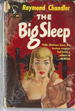
The next logical step in my research was to look at some of the previous covers for The Big Sleep. Here are some of the most interesting ones I found, in no particular order.

This person was obviously answering the brief "do a cover in the style of Saul Bass". I do like it though, probably because I have always like Saul's work. I saw this in Mr B's in Bath, along with a few others in the series:

So I won't go for the Saul Bass look with my design. I do however think that a boldly-coloured graphic style could work really well. Moving on...

I quite like the look of this one. It's very simple and graphic but I am not sure that it would really jump out at you from a crowded bookshelf. Speaking of which, I must take Teresa Monachino's advice and take my mockups into Mr B's to photograph them in situ. That's a while off yet though.

This is pretty nice - it looks contemporary while using photography from the era. It could be perceived as a bit of a cliché though. Maybe I could take a crime scene image from LA in the 90s, like from the gang violence in Compton? That would certainly bring it up-to-date. It wouldn't really reflect the content of the book though.

I'm not really sure what that one is getting at - the red and blue of police lights? The flag of the US?. It doesn't even look particularly interesting.

This one looks quite classy but the typography isn't very nice and the image of a guy lighting a fag is too predictable. Nice crop on the photo though.

Below are a few others I picked out but don't really have anything to say about.

So, there are a whole bunch of ideas that I will try to avoid completely. I think my next step will be to look at modern crime fiction covers to see if I can identify any trends or designs that seem to work especially well in the genre.