I have been thinking long and hard about what to do for my final project. I was thinking about doing a re-branding exercise for a post-coalition Lib Dem party, something biting and satirical that at a glance could pass as a real piece of PR. But I decided that I wasn't sure of my angle, beyond a comical "Hey, we fucked up!" approach. I figured I would wind up spending way too much time researching the politics and generating original content, when in reality I am on a design course, so my focus should be on that aspect.
While watching football over the weekend, I discussed my favourite terrace chants with a mate and thought it might be nice to make a little hymn book called "Hymns from the Terraces" or something similar. I would want it to look just like an old hymn book that you would find in a church. The content already exists - my job would be to research and find the best examples, organise the content in an appropriate manner and typeset it beautifully in a lovely little case-bound hardback book. It would be a really nice thing, the content would be funny and it would also be a comment on football being "the new religion".
Then I started thinking about how actors and pop stars are so revered these days - aren't they "the new gods"? How about making a little hymn book for the 21st century, containing the lyrics from the best songs of all-time? I think it would be great to see the lyrics to Beatles and Abba songs presented in a different way. How about Morrissey, or Oasis? I can't stand Oasis personally but I would still put some of their songs in, as they mean a lot to so many people. I could make my selection from all the "Best Song Ever" lists that are published by the music press each year.
Yes, I like that idea. Perhaps I will do that.

THIS IS THE BLOG OF ANDY ASHWIN, THIRD-YEAR GRAPHICS STUDENT AT BATH SCHOOL OF ART & DESIGN. I'LL TRY TO UPDATE THIS ON A REGULAR BASIS WITH MY THOUGHTS, WORK AND LINKS TO STUFF THAT MAY ONLY BE OF INTEREST TO ME.
Showing posts with label Secondary Research. Show all posts
Showing posts with label Secondary Research. Show all posts
Wednesday, 3 April 2013

Saturday, 9 March 2013
Bath Uni - A visit to a science fair
Today I popped down to Green Park Station to take a look at the annual Bath Taps Into Science event. I wanted to see how these things were presented and thought it might be nice to catch up with some of the Bath Uni people.


First impressions were that it is very busy, each exhibit only has a tiny amount of space in which to work and that the use of Comic Sans was abundant! I can certainly see why Bath Uni were keen on getting us involved. The whole thing looked very Blue Peter, which, in a weird way, was part of it's charm. I introduced myself to the guys from Bath Uni - they didn't seem to be aware of the collaboration as they were first years and we are dealing with third years and above. Funnily enough it is actually these very first years that will be taking our designs to Cheltenham Science Festival!
I was slightly perturbed to see these crudely designed posters:


Why were we not aware of these? They will obviously have to be redesigned to keep them inline with our new branding. I have contacted Bath Uni to get hold of the files. One of the guys on the stand mentioned that the laminated sheets were printed on both sides and that no-one actually ever turned them over. I will bear this in mind with the redesign.


First impressions were that it is very busy, each exhibit only has a tiny amount of space in which to work and that the use of Comic Sans was abundant! I can certainly see why Bath Uni were keen on getting us involved. The whole thing looked very Blue Peter, which, in a weird way, was part of it's charm. I introduced myself to the guys from Bath Uni - they didn't seem to be aware of the collaboration as they were first years and we are dealing with third years and above. Funnily enough it is actually these very first years that will be taking our designs to Cheltenham Science Festival!
I was slightly perturbed to see these crudely designed posters:


Why were we not aware of these? They will obviously have to be redesigned to keep them inline with our new branding. I have contacted Bath Uni to get hold of the files. One of the guys on the stand mentioned that the laminated sheets were printed on both sides and that no-one actually ever turned them over. I will bear this in mind with the redesign.
Friday, 8 February 2013
Penguin Design Award - Getting Crafty
I gathered some rather lovely imagery for the cover of The Big Sleep, keeping with my theme of surreal noir imagery and the setting of the Hollywood Hills. Initially I was going to create some collages in Photoshop, but then I thought that it might be nice to set it all up in a 3D environment, perhaps in After Effects, where I would have total control over camera positions and lighting. However, I worry that I am too quick to jump to a technological solution where there is perhaps too much control and not enough space for "happy accidents", so I decided instead to make a little set, using cutouts, wire and blu-tack, all arranged on some handy blocks of polystyrene that I found in the studio.


I decided to use the font ITC Machine for the cover, as it is very similar to the lettering on the Hollywood/Hollywoodland sign. I thought it would look cool to have the lettering actually as a part of the model, fixed to the different layers of terrain, rather than slapped over the top afterwards.
For a bit of secondary research, I looked at the beautiful work of Big Active in their book "Head, Heart & Hips", as well as the surreal collage work found in "Vizz: Outrageous Visual Communication":


I set to work stick all my imagery onto mount board and cutting out each individual prop with a scalpel. It took forever!


I decided to use the font ITC Machine for the cover, as it is very similar to the lettering on the Hollywood/Hollywoodland sign. I thought it would look cool to have the lettering actually as a part of the model, fixed to the different layers of terrain, rather than slapped over the top afterwards.
For a bit of secondary research, I looked at the beautiful work of Big Active in their book "Head, Heart & Hips", as well as the surreal collage work found in "Vizz: Outrageous Visual Communication":


I set to work stick all my imagery onto mount board and cutting out each individual prop with a scalpel. It took forever!
Thursday, 7 February 2013
Penguin Design Award - Man Ray
After coming up with a few surreal collage designs, I stumbled across this incredible image by Man Ray:


It reminds me of the kind of thing I achieved with one of my designs, with the reclining woman and the hills, and Man-Ray is very much the embodiment of surrealism and Hollywood in the thirties. Next I will attempt to adapt my cover to make it more of an homage to the great Man Ray.
Monday, 4 February 2013
Ski App - More secondary research
I decided to look at some other, non-skiing magazine apps to see how they presented text and images on the iPad. I really like Distro, which has definitely been designed specifically for viewing on a tablet device. The typography is beautiful and the navigation is intuitive and unobtrusive, just as it should be:


Peephole is another stunning online publication, which really uses the capabilities of the iPad to deliver rich content, including animation and 360-degree panoramic photos:


I doubt very much whether this was put together with Mag+, or if it indeed could be. As it stands I don't think that the fancier content will be possible for Inside Track, at least for version 1. I can however draw some editorial design inspiration from both of these lovely apps, leaving the bells and whistles in the background for now.
Wired is another beautiful app, with amazing photography, typography and interactive features (mainly clickable hotspots, which I definitely can do in Mag+). Even the adverts in it are works of art:


I really love the simple, elegant design of Design Bureau. The type treatment is always very modern and quite experimental. I particularly like their use of T-Star Pro, which I think I will use for my app.


Peephole is another stunning online publication, which really uses the capabilities of the iPad to deliver rich content, including animation and 360-degree panoramic photos:


I doubt very much whether this was put together with Mag+, or if it indeed could be. As it stands I don't think that the fancier content will be possible for Inside Track, at least for version 1. I can however draw some editorial design inspiration from both of these lovely apps, leaving the bells and whistles in the background for now.
Wired is another beautiful app, with amazing photography, typography and interactive features (mainly clickable hotspots, which I definitely can do in Mag+). Even the adverts in it are works of art:


I really love the simple, elegant design of Design Bureau. The type treatment is always very modern and quite experimental. I particularly like their use of T-Star Pro, which I think I will use for my app.


Ski App - Some secondary research
I spent some time over the weekend looking at various ski apps and mags on my iPad, to get some inspiration for types of content, as well as for the overall look and feel of Inside Track (my app, in case you have forgotten!). I especially liked the Freeskier magazine app for it's beautiful photography and type. I think that the use of white space is very elegant and gives the publication a classy feel:


The imaginatively-named Skiing is also a really nice mag app (appazine? bleurgh!) although I feel the pages are just a bit too busy for viewing on an iPad. It looks as though it is simply PDFs from the print mag:


Most of the other mags also seem to be straight ports from their print cousins, which is a bit of a shame (and pretty lazy in my opinion). These include In The Snow, Ski and Snowboard and Ski Magazine, although the latter does at least give the near full-screen photography room to breathe:


The imaginatively-named Skiing is also a really nice mag app (appazine? bleurgh!) although I feel the pages are just a bit too busy for viewing on an iPad. It looks as though it is simply PDFs from the print mag:


Most of the other mags also seem to be straight ports from their print cousins, which is a bit of a shame (and pretty lazy in my opinion). These include In The Snow, Ski and Snowboard and Ski Magazine, although the latter does at least give the near full-screen photography room to breathe:


Penguin Design Award - A Fresh Approach
I have decided that the Penguin brief has become too restrictive for me. They state that one should "avoid the usual cliches" associated with crime novels, particularly of the era, and this has given me something of a creative block. So, I have decided to embrace all the cliches, stuff like:
Along with all the usual LA cliches:
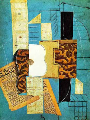
So, I will actively embrace all of the cliches but I will present them in a different, more surreal way. I have been looking at surreal collage recently and really enjoying it aesthetically, especially the work of Julien Pacaud, Max-O-Matic and Mario Wagner, as well as Richard Hamilton, Jamie Reid and Picasso. The images below capture elements of the sort of look and feel I am aiming for with the cover for The Big Sleep.


- booze
- cars
- dames (lips/legs esp.)
- cigarettes (smoke, ashtrays)
- guns (smoking)
- long shadows
- black & white
- cops
- corruption
- raincoats
- hats
- gambling (cards/roulette/dice)
- murder
Along with all the usual LA cliches:
- sun
- Hollywood
- glamour
- palm trees
- excess
- greed
- corruption (again)
- murder (of course)
So, I will actively embrace all of the cliches but I will present them in a different, more surreal way. I have been looking at surreal collage recently and really enjoying it aesthetically, especially the work of Julien Pacaud, Max-O-Matic and Mario Wagner, as well as Richard Hamilton, Jamie Reid and Picasso. The images below capture elements of the sort of look and feel I am aiming for with the cover for The Big Sleep.

Future Islands - Julien Pacaud

Campo Cortos - Max-O-Matic

Venture - Mario Wagner

Hotel du Rhone - Richard Hamilton

No Feelings - Jamie Reid

Unknown Collage - Picasso
My next step is to find a lot of old photography from thirties/forties Los Angeles in order to create a beautiful surreal collage of my own.
Friday, 1 February 2013
Ski App - Research
I knocked up a flat plan so that I could get a clearer idea of the actual layout of my app. I find it much easier to do this sort of thing on paper, where I can scribble bits out, move stuff around (with big curving arrows!) and generally get a feel for the project. I am not going to reproduce it digitally as that would be a waste of time (and I am very busy), so here is a photo of the first plan:

Most of the stuff on the flat plan came from a list of areas I wanted to cover in the app. Here is a photo of the actual list:

I arrived at this list after poring over loads of magazines and leaflets, which I picked up from the chalet, at lift stations and from the tourist information office. Here are some of them:


I also talked to staff at local bars, as well as chalet staff and our ski rep. Here are some shots of the notes I made in my pretentious Moleskine notebook:


So there you have it. Not the most exciting blog post but I just wanted to have all this research in one place.

Most of the stuff on the flat plan came from a list of areas I wanted to cover in the app. Here is a photo of the actual list:

I arrived at this list after poring over loads of magazines and leaflets, which I picked up from the chalet, at lift stations and from the tourist information office. Here are some of them:


I also talked to staff at local bars, as well as chalet staff and our ski rep. Here are some shots of the notes I made in my pretentious Moleskine notebook:


So there you have it. Not the most exciting blog post but I just wanted to have all this research in one place.
Subscribe to:
Posts (Atom)