Showing posts with label Thursday Lectures. Show all posts

Friday, 19 April 2013

Thursday Lecture - Pat Starke


Yesterday's guest industry lecturer was Pat Starke, creative director at Design Activity in Bristol. He wore his belt buckle in a jaunty manner, almost on his right hip, which was a bit strange. Creative types, eh? He had my attention.

He told us that he was from Aldershot and that, upon graduating, he took up a role in a really good small studio where he learnt his trade. Ambition eventually drew him to London where he worked for a pretentious studio with a classic wanker boss. Pat told us that there is no need to be an arsehole when you are boss, which is something I totally agree with. I have worked for them in the past and it is obvious that a culture of fear and intimidation is not conducive to good work. He also said that he does not work late, as a matter of principle. Life is too short and there are plenty of other things he wants to do. Again, I find this attitude refreshing. I used to work in the games industry and we were expected to do insane amounts of unpaid overtime, even when we were on schedule. One producer even offered to give me some pointless work to do, so that I would get behind and have to do overtime to catch up, just so it looked good on the boss's spreadsheet!

I fully expect to put in the hours when a deadline approaches, or if you get an unexpected opportunity to pitch for a huge client and time is of the essence - that is absolutely fine and I know that "going the extra mile" makes a good impression, especially when you are starting out.

Pat then went on to show us some of the work he has done over the years. It was all really high-quality branding/packaging stuff for some massive clients. One interesting tip he gave us was that when working for a corporate client, show them a range of concepts, from conservative to completely mental. You'll be amazed how many times they will choose the latter, or ask for something in between. What I found really interesting was the rebranding work he did for Bulmers when they introduced San Miguel to the UK market:


The bottle on the left is the original one sold in Spain. The rebrand is incredibly subtle although in many ways I actually prefer the original. It just looks classier. He said it was important on jobs like this to look at the history of the product and to use iconography that fits, which is why they kept the ship from the original. They also added a crest that looks very similar to the Barcelona FC badge to the UK product, probably to make it look more instantly Spanish.

He then showed us the work he did for Agnelle gloves. These are a premium product from France and he was packaging them for the US market. There were a number of different ranges that needed branding, from the top-end couture gloves to the cheaper sports range. Each needed to packaged accordingly. He said rather than researching what it is to be French, it was important to base everything on the US perception of France. Makes sense. I like the mental bag design concepts he did for the top-end product:


Next was quite a long story about his relationship with The Fabulous Bakin' Boys, who make a range of muffins and flapjacks, etc. I have never actually like their packaging - it looks like a cheap stab at Americana and I just don't think it works. It's never made me buy any of their products, as I assumed they would taste cheap and artificial (which is maybe why I often see them half price in Sainsburys).


My tastes aside, the point he was making was that it was important to develop relationships with your clients - only when you really get on with each other can you produce great work. He also made the point that despite their relationship being so good, they were eventually dropped by the client. You need a thick skin in this industry.

I really liked the packaging and logo designs for both Le Canard Et La Lune and Savse Smoovies and would definitely be tempted to buy them if I ever saw them in the supermarket:


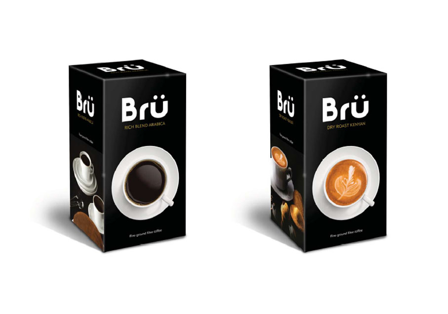
Pat then talked about how Design Activity will regularly approach a large successful company with ideas for new product ranges. The idea is that they may like the idea and want to go ahead with it, based on the awesome packaging designs. Or they may just remember you and admire your proactive spirit, which could stand you in good stead with them in the future. Or they may just nick your ideas and do with them what they will. The latter is of course a risk but in Pat's experience most folk are decent human beings. He said that if nothing comes of one of these projects, at least you have more good stuff to add to your portfolio to show other clients. I think it is a brilliant idea. I also want to get the Photoshop skills to mock up products like this:


He finished by giving us some tips on getting a job:
  1. Plan your route. London? Stay local?
  2. Understand the competition (fellow students).
  3. Research your targets. Look at their work. Find the name of the creative director and write to him directly. Talk about their work as well as yours and try to do something memorable.
  4. Make contact with them. Ask for portfolio advice. Most people appreciate how hard it is (they have been there themselves remember) and will offer help.
  5. Polish your portfolio. Fill it with ideas, quirkiness and practical considerations.
  6. Persist!
I found Pat Starke to be very likeable and full of useful advice. I also really like the sort of work he does. It's a real shame that I didn't get on board with the Buddy Scheme as I think spending a few hours with him would have been very helpful. Perhaps I will take his advice and contact him in the near future, once I have got some strong branding projects in my portfolio.

Friday, 15 February 2013

Thursday Lecture - Neil Drabble

Neil Drabble is an old mate of our tutor Nigel, as are most of the guest speakers who come to Sion Hill. He teaches graphics and photography at one of the fancy art schools in London but also produces an insane amount of work in a variety of fields. There are two bits of work that Neil has done that made me really want to go to his lecture. Firstly there is this:


These beautiful geisha sculptures are made from a bunch of his kids' socks that his wife was going to throw out. There are no cuts or sticking and no other materials added, he just twists, folds and ties a sock until it looks like a geisha - really amazing! The fact that they are made from something so personal to him only adds to their beauty.

There is another side to Neil's work... Something really puerile that appeals to me hugely. Lots of his stuff includes cocks, shit and swearing. My favourite piece has to be this:


The piece is entitled Fuck Forever and he has actually gone to great lengths (fnar!) to paint this hideous scene, the likes of which can be found on those awful plates that grannies buy from ads in the Radio Times, and then he has daubed a huge comedy cock on it! I have no idea what he means by it but I really like it, partly because of the apparent destruction of a lot of painstaking work. Perhaps it isn't destruction though, as the image takes on a completely new meaning with the graffiti nob. I just don't know what it is...

After seeing this image it was obvious what I would do for the lecture poster. I simply printed the important details (who/where/when) digitally, then grabbed a brush and painted on a huge cock in his honour:


Yasmin clearly likes it. The wanger is obviously erect, suggesting that we are happy that Neil is coming to talk to us, a message that is reinforced by the crudely rendered "YAY!". Seriously though, as a poster I think it really works; it looks great, it certainly grabbed everyone's attention and it informed clearly about an event. Best of all Neil really like it and wanted a copy to take away! I told him that I made every effort to draw the cock exactly as he drew them, rather than my usual profile style where you would see only one ball. He commented that "you can tell a lot about a person by the way they draw a cock", which is something I have also always believed.

The thing is that Neil can really paint. I may be in the minority but I find that I will give a lot more time to someone's more conceptual work when I know that they have real talent and are not just a chancer with rich mates, like Emin, Hirst et al. His series of paintings for Amateur are fantastic and are based on "reader's wives" type ads from porn mags.


Must be great to be able to paint your own porn! Other projects that really stood out include the banana skin made out of plaster entitled "Andy's Dead", a reference to Warhol and the classic Velvet Underground album cover. He actually picked a banana skin up off the street, made a mould out of porridge (wtf?) and then cast it in plaster before it painting it to look exactly like the original found banana skin. Mental.

My Arsenal looks at first to be just a table covered with various weapons. Closer inspection reveals that everything is made from household packaging and food containers, sprayed black. Really, really cool:


The attention to detail is really staggering, which seems to be a bit of a pattern in Neil's work. I think I could learn an important lesson here.

A large part of Neil's work is photographic. In fact, he worked primarily as a portrait photographer when he was in his early twenties, straight out of art school. He showed us a series of portraits of his favourite contemporary composers; the likes of Philip Glass and Michael Tippett. He managed to gain access to such famous people simply by writing to them and asking! From this he ended up getting commissioned to photograph loads of legendary people, including Woody Allen, David Byrne, Jackie Chan and my all-time musical hero Arthur Lee. The photos are really intimate and unpolished, mainly because Neil set himself the constraint of never using a studio or artificial lighting. I love this one of Stephen King:


I was surprised when Neil told us that the master of horror was in fact a really nice and funny man - a natural comedian. It must be pretty cool to meet so many of your heroes, providing they don't turn out to be dicks.

Another major project that Neil showed us was My Name Is Roy - a photographic study of his friend's son growing up in the US. The "warts and all" photos are always interesting and at times slightly unsettling; I half expected to hear that Roy eventually massacred everyone at his High School. Was that the intention? What does that say about me and my perception of the suburban US? Anyway, turns out that all of the photos were constructed/posed, which adds another dimension of meaning. Neil suggested that it might be that the project was in fact a portrait of himself. I understood what he was talking about but didn't take very good notes on it, so I will leave it at that.


This write up has only scraped the surface of the vast body of work that Neil has created. He was around all day prior to the lecture and gave loads of people tutorials. I only wish that I got one as I think I would have learned so much from him.

Friday, 1 February 2013

Thursday Lecture - Keith Hancox

Keith graduated from Bath Spa five years ago. He currently works as a designer for Mytton Williams in Bath, who are one of the more respected design firms in the area (their clients include Waitrose and Clarks Shoes). By night he runs a collaborative online design shop called Polar with his girlfriend, with the USP that everything they do is red and white. Perhaps they should add green and they might make a killing at Christmas. Just a thought...

He showed us a few of the branding jobs that he was particularly proud of, in particular the work for the Halcyon Hotel and Circo club in Bath, which are both a part of the same company.


I think that they are both pretty decent logos but it would have been nice to know exactly how big a part Keith played in their design. There was definitely a design team involved, rather than an individual, so it would have been interesting to know what his particular role was. Apart from these two branding projects, Keith didn't really show any of his work, opting instead to give us some general tips about the business, based on his experiences to date.

Firstly, we should all listen to Anthony Burrill. While I agree that we could all do well to live by the sentiments of Burrill's best-known piece - "Work Hard & Be Nice To People" - I am not so sure that he offers any other sage advice to budding designers. I assume that Keith was present at an inspiring lecture by Burrill during his time at Bath Spa.


He then told us how we should "understand the client" and figure out what makes them tick, particularly by researching their business at the start of the relationship. Now, this sounds pretty obvious to me and no doubt to anyone else who has worked for a client in any capacity in the past, but I understand that it was worth him mentioning it for the benefit of many present. More pertinent to me was his insistence on the importance of doing work placements. I am ashamed that I have not done any of these yet, especially when I keep hearing how they are more useful than most of the stuff learned on a degree course, even though you often spend more time making tea than designing. I certainly wouldn't have a problem running such errands, just to be in a professional studio for a week or two to see how they go about their work. I will get something sorted for after final hand-in on May 14th.

There were a few other things that I found useful - stuff that I already knew but perhaps don't regularly apply to my own practice:
  • Your first idea is not always the best. I often find myself investing too readily in the first decent idea I get. I am then reluctant to put it on ice while I explore other avenues. This is not good and it is something I should force myself to do.
  • Get loads of ideas down but set a deadline. If I don't come up with a great idea right away, I can get sucked into a research whirlpool, whereby I come up with LOADS of different ideas without actually fleshing any of them out.
  • Get your inspiration OFFLINE. This is something I have heard over and over from successful designers. Stop looking at blogs and design magazines and get out into the real world. Check out art galleries, music and the like but also look at nature. Keith likes to just wander the streets, taking pictures of things he finds funny or interesting. I am not sure if these ever directly feed into his work but it can't do any harm.
So, while it would have been nice to have seen a bit more of his work, I did find Keith's lecture informative and will definitely try to put some of his tips into action, albeit belatedly.

Friday, 14 December 2012

Thursday Lecture - David McKendrick

David McKendrick is the Creative Director at Esquire magazine. He jetted in from New York for the lecture and apologised in advance in case he was not quite with it.

David's design career started when he joined Graphic Thought Facility (GTF) straight out of uni in 2000. He describes the job as something of "an extended apprenticeship" and says that he was "a bit of an arse-licker for a while", taking on all the tedious jobs that no-one else wanted to do. This seems to be a pretty good way to get on in a company and it wasn't long before he started to get asked to do some of the more interesting work.

In 2004 David joined North and quickly learned about the particular issues that arise from working with more corporate clients. He was brought in primarily to bring the GTF style to the staid world of the corporations. He showed us a branding campaign that he worked on for a credit card provider called "Seven" - it was pretty unspectacular to be honest yet still took nine months to complete, which is apparently standard when dealing with such big clients. Must have been pretty boring. He mentioned that it was important not to show a client too many ideas as they tend to pick their favourite bits from each one with scant regard for how the whole will hang together. I have already experienced this in the past few years with web design.

From 2006 to 2007 David was hired by Wallpaper* magazine, where he was involved in some editorial design but mainly handled other projects and events that were outside of the magazine itself. This seems to have been a pretty creative time for him and he got to produce some really nice stuff working with large budgets. There was a good cautionary tale from this period too - never write bad stuff as placeholder text in case it accidentally goes to print! This also applies when giving files on your machine names like "website-for-asshole.psd".

In David's instance, a massive client (vodka brand I think) paid for a four page advertorial piece in Wallpaper*. When the first issues came back off the press, the headline at the start of the piece said something like "TEXT COLUMN". Suffice to say the company, who had paid a fortune for the piece, were less than impressed and Wallpaper* had to run the corrected version for free for the next few issues. Having worked in publishing, I am amazed that this can happen as there are so many people that look at the files before they go to print - art editor, production editor and editor at the very least. Despite this I have on numerous occasions seen the word "caption" under a photo in even the biggest newspapers and mags, or a line of "lipsum".

In 2008 David took on the role of Creative Director at Esquire. The magazine was looking tired and dated and was struggling to sell advertising (I didn't realise that it launched in 1939 in the US). David breathed new life into the mag by changing all of the typography as well as the photographic style, while making the whole thing look more structured and thus sophisticated. He also used a variety of paper stocks throughout the mag to further separate the distinct sections.

I personally love what he did with the covers. Each one is unique and playful in its design, while the subscriber-only editions are stripped right back and rely heavily on the strength of the photography. Check out the January 2013 covers for an example:

Many of the covers made interesting use of typography, based on the cover star for the issue. Look at what they did with the logo for the Lewis Hamilton issue:

I also like how playful they were with the barcodes on some issues. The one for the Kaka (Brazilian footballer) issue was particularly nice:

When Alex Bilmes took over as editor of Esquire UK in 2011, David feared that his time at the magazine may have come to an end - new editors often bring in their own teams to put their stamp on a publication. In fact, David had known for some time that a new boss was incoming, so he actually did some of his most daring design work, free as he was from any fear of consequence. As it transpired, he and Bilmes shared a vision of where Esquire should be headed and agreed on a revamp that would make it appear less exclusive in order to appeal to a broader market. There is no doubt that the subsequent redesign was nowhere near as beautiful as the previous one, but at least it looked much nicer than the other "lad mags" that were vying for the same readership.

There was however still some room for good creative design. I particularly like the way that David tends to tailor a design to make it appropriate to a particular feature. For instance, a feature on meat sees all the pull quotes handwritten on those little plastic signs that butchers stick into a joint of meat or pile of chops.

David finished up by sharing a few pearls of wisdom from his design career:
  1. Don't get involved in office politics
  2. Don't shag anyone at work
  3. Make the most of your opportunities (like he did at GTF)
  4. Get inspiration elsewhere - try not to look at other design (I hear this a lot)
All very useful I am sure. Shame he was too tired to go for a pint...

Friday, 7 December 2012

Thursday Lecture - Si Scott

This lecture was eagerly awaited by everyone at uni and there was a real buzz about the place before it kicked off at 5pm. We were not disappointed.

Nigel Robinson introduced Si as a mate and one of his former pupils. Si apologised for his lecture style, saying that he doesn't use notes and tends to go off on tangents. He started by showing us some of the work he did in his final year of study (back in 2002 if I remember correctly). There was a beautiful fold-out journey through New York, comprising photographs and hand-rendered typography. It would appear that hand-rendering his one type was a big thing for Si even then. Interestingly he mentioned that he had not found his own style until late in his third year. Perhaps there is hope for me yet...

It turns out that his distinct style didn't arrive consciously either - he just kept doing loads and loads of work that he enjoyed and it just kind of emerged. This endless repetition goes some way to explain how he manages to work in pen directly onto paper, usually without pencilling any sort of guides. A risky way to work but in a way it adds real value to the outcome. Just look at the intricacy of his beautiful work:

Si was incredibly frank about working in the design industry, regaling us with tales of arsehole art directors, pompous designers and a run-in with a representative of Madonna. The latter involves a design he did for a greatest hits album. Si took an existing photo of Madonna on a cross (yeah, you are a lapsed catholic Madge, get over it), photoshopped the naff cross out and had her kind of intertwined with a beautifully hand-rendered MADONNA, each letter unique and representing the various personas she had adopted over the years.

Her representative was hugely impressed with the concept but was worried that he had had no input himself and that she might notice that he was superfluous. So, he started demanding unnecessary and unreasonable changes to the artwork. After a bit of playing along, Si decided that it was not worth the hassle. He didn't want his name attached to something that was not really his any more and, as he puts it, "it wasn't like they were paying me a life-changing sum of money". So he told them to do one. The representative was less than happy about this and warned Si that he would never work in this town [Los Angeles] again. Needless to say Si has worked in LA since and is no longer worried about a visit from the Madge Mafia.

Come to think of it there were quite a few stories about unpleasant people. One of my favourites involved a charity auction that Si did a series of illustrations for. Each poster used the lyrics from songs by legendary Manchester bands and was for a kids' charity in the area. As a courtesy, Si contacted the agents of all the bands to check that it was okay to use the lyrics. Everyone was fine about it, even those pricks from Oasis, except for Morrissey. What an arse. I am pretty sure Si used the "There Is A Light" lyrics regardless. He then told us about a jumped up self-styled design legend who was a total pillock, although he said he would prefer not to tell us who it was (at least until we got to the pub), so I won't share it here either.

Back on the subject of Si's work, I was totally blown away by this gig poster for The National:

Lovely, isn't it? Even lovelier when you take a closer look and realise that the lillies are hand-drawn!

Amazing stuff. Si is certainly one of the most talented people I have ever met, so it was really nice to find that he is also a genuinely nice bloke without an inflated ego. He invited us all to join him and Nigel in the pub after the lecture, which was a lovely touch, and many of us obliged. The biggest thrill for me was when they strolled in and Nigel told me that Si loved the poster I had created for his lecture. I told Si that he must be mistaken and was talking about one of the other posters, so he got out his phone and showed me the photo he had taken, before asking me how I made it. Wow! Perhaps I should stop being so critical of myself.

Unfortunately I had parental duties to attend to, so left the pub after just the one pint (I was also driving), which was a real shame as I was enjoying chatting with Si. By all accounts I missed out on a pretty eventful night. Anyway, enough of the idle gossip. I will finish with another example of Si's awesome work. He has recently been doing a lot of stuff with paper, like this amazing butterfly wing:

That CD cover is not actually 3D; Si made the wing out of paper and then got it photographed rather beautifully. It is a stunning effect and I am very keen on doing some work like this, whereby I make real things and then photograph them and add type, rather than working solely on the computer. It really adds something.

So, thanks to Si Scott for sharing his amazing work. Hopefully he will give us a masterclass at some point next semester and I will be able to buy him a pint or two for giving the most inspiring talk I have ever experienced.

Friday, 16 November 2012

Thursday Lecture - Rose Blake

I must start by saying I was half-tempted to not bother with this lecture as I am a bit tired of naive hipster illustration. I ended up going along simply to make up content for my Professional Contexts dossier. I am glad I did.

Firstly, I was surprised that Rose looked very normal, in a kind of shy librarian sort of way; nothing like the ironic xmas sweater and glasses type I was expecting. Shame on me for my stereotyping. Best of all she opened by admitting that she can't draw - obviously she can but she certainly fits into that exclusive group of honest and modest designers, along with David Pearson and Si Scott. This is a personality trait that cannot be faked and should not be underestimated.

So to her work. Despite my reservations regarding contemporary illustration, there is something I really like about some of her stuff, especially her depiction of Gilbert & George playing volleyball with a tomato on top of a kebab:

I guess it appeals to my love of the surreal, and Gilbert & George of course. I also liked her illustration depicting a visit to a Henry Moore exhibition, in part because I like Henry Moore's stuff:

Some of her work for No Brow was very generic, looking just like about a quarter of last year's degree show (and the year before), but at least that is only one of her styles. She also showed an example of an illustration that was used repeatedly on the BBC website, earning her around £3000. Not bad at all and perhaps a reason why I should never say that I am definitely not an illustrator - surely I can knock out some of this naive stuff too, even if I do it *choke* ironically. Isn't it all ironic anyway?

Rose does quite a lot of editorial illustrations and some of these have been commissioned by The Independent and even The New York Times. Her work for the latter reminds me very much of Maira Kalman, which may be why they commissioned her in the first place.

I was also delighted to hear that she had designed a bunch of t-shirts based on Robyn Hitchock songs. I have a soft spot for his unique brand of lyrical madness - who wouldn't love The Cheese Alarm?

Illustration aside, Rose had her fingers in a couple of other interesting pies. Firstly she is involved in a collective called This Is It, that started out with a 'zine (like Artshole perhaps?) and now makes mental art films. These look like fun projects to be involved in, providing a bit of a break from drawing while keeping the creative juices flowing. I think it is important to occupy yourself with a range of creative pursuits outside of design.

Finally she showed us her Studio Music project. This is a simple website that lists what famous designers (and Kevin Spacey!) listen to while they work. It's an interesting project in itself but more than that it has opened a lot of doors for Rose - she has made some serious contacts in the design world off the back of it and continues to build on it. A very clever marketing ploy and not half as cynical or calculated as most of these kind of things seem to be these days.

As with all decent people, I wish Rose Blake every success!

Monday, 5 November 2012

Thursday Lecture - Yuri Suzuki

Having looked at Yuri's website while researching for the lecture poster, it was pretty obvious that his talk would be a bit different. He stated from the off that his work was all about 'sound and physicality', which roughly translates to 'making fucking mental mechanical instruments' in order to explore what he calls 'the physical value of sound'.

First up was the Sound Chaser - a tiny mechanical stylus/speaker on wheels that pootles round a track constructed from bits of old records.

This is quite clearly a bit mad and the sound produced is horrendous, but I really like the idea and can imagine it having an application in something like an advertising campaign. I think the idea of making something new out of old junk is a reccurring theme in Yuri's work. I nabbed the image from Yuri's blog - I hope he doesn't mind...

Sound Chaser from Yuri Suzuki on Vimeo.

Next he showed us a clip of his Colour Chaser, an amazing little vehicle that follows a line drawn on paper. When you scribble different coloured areas across the 'track', the thing actually interprets the RGB data as different tones. Very cool. It would perhaps have been even better if he demonstrated the kit by getting it to play a recognisable tune. It's not commercially available, which is a shame, as I am sure my son would adore it.

Colour Chaser 2010 from Yuri Suzuki on Vimeo.

Another interesting project is Analog-Digital, whereby he created a CD with grooves cut into the surface so it could aslo be played on a turntable. Again, there is no real practical application for this but then it is actually a kind of modern art. The thing with Yuri's work is that none of it can actually be described as graphic design, so it's not especially relevant to what I am doing, but most great designers advise students to 'look outside of design for inspiration', so I understand why he was invited to show us his work.

Yuri is very keen on getting people involved in his projects, so he often spends time creating sort of modular kits, then getting others in to help him explore their creative possibilities. One such kit is the Denki Puzzle which consists of stylised pieces of printed circuit board (PCB). The shapes themselves are indicative of the function of the specific piece, allowing people with little or no knowledge of electronics to create simple, functioning circuits. They also look really cool, which is probably why Lizzie Sharp reproduced them for her awesome lecture poster!

http://lizziesharp.blogspot.co.uk/2012/10/yuri-suzuki-giving-lecture-at-our-uni.html

My favourite piece of Yuri's work is definitely the amazing robots he made for Japanese band's music video. He said that he and his team spent three months making these, as if that were a long time - looks like a lot more than three months work to me!

Music video : androp World.Words.Lights from Yuri Suzuki on Vimeo.