Showing posts with label Workshops. Show all posts

Thursday, 14 March 2013

Workshop - Typography with Rupert Bassett

Yesterday I spent the whole day in a typographic workshop with our semi-resident type guru Rupert Bassett. He kicked the session off by showing us his collection of corporate branding guides. There was a rather lovely big hardback for the RAC which he worked on back in the 90s. It was incredibly anal, as you might expect, with for example a whole page dedicated to showing the exact shade of white that can be used by the RAC. Similar pages set out the use of orange, blue, etc. The whole thing was beautifully put together and Rupert told us that it cost a fortune to make, as each copy required the printing of loads of spot colours and special finishes like UV varnish.

There was a fantastic slip-case that contained envelopes with style cards for each of the teams in the NFL. They looked like they were from the seventies at the very latest (I noticed the Washington Redskins logo was different to any I have ever seen) and Rupert said he picked it up really cheap at a second-hand book store in New York. The other highlight was the brilliant NASA style guide, which he was given by a friend. He said that he had subsequently been offered a "four-figure sum" for it by another designer. It is a very cool thing.

After browsing these treasures for a while, Rupert informed us that our task was to create a brand guide for the Typography Workshop that we were currently involved in. Excellent. I set to work straight away, bashing out a bunch of initial ideas:


I got a bit hung up on the whole German thing, which was really just a bit of an in-joke because it is very much Rupert's kind of thing. I rather like the one right in the middle in Comic Sans, the ironic use of which would instantly be apparent to anyone attending a typography workshop. No?

I had one more daft idea to get out of my head before I could move on:


Anyway, I then started playing around with the letter T, duplicating and flipping it to see if it could also form a W. It does to a degree and I kind of like the way that it becomes more of an abstract mark:


Here are a couple of ideas that I developed from that initial experimentation:


Rupert suggested that I should try to make the mark work in a square, which is how I came up with this:


I definitely prefer the one to the left, with the text on one line. I thought it would make sense to also make a variation on the theme, where the text sits alongside the mark.


I think I am definitely onto something. Here's an example of the two variations working with a few different colours:


I am not sure whether to take this project any further at the moment. It would be nice to create an entire branding guide for the Typography Workshop but I am not sure I will have the time. If I were to do it I would want to cover at least the following:
  • Typography guide
  • Colour palette (TW Blue, TW Red, etc, with Pantone refs, CMYK, RGB and Web)
  • Grid structure
  • Photography usage guide
  • Logotype usage guide (showing correct and incorrect usage examples)
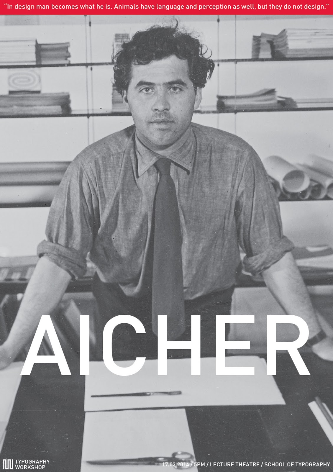
  • Poster design guide (A0, A1, A2, A3, A4 - show example posters of dream guest speakers)
  • Billboard design guide
  • Screen use
  • Advertising
  • Website
  • Letterhead
  • iPad
  • Business card
  • Uniform (staff and students)
I'll leave it there for the time being. However, here are a couple of poster ideas I came up with:

Thursday, 28 February 2013

Workshop - Lomokev

I got to spend today working with the rather splendid photographer Kevin Meredith (aka Lomokev) in a street photography masterclass. Kev gave a lecture when we were in the first year and I particularly remember liking a lot of the stuff he shot around Brighton, especially the exploits of the Brighton Sea Swimming Club. He started by showing us a short presentation of his work, some of which we had seen before, some of which was new, and then gave us our brief for the day.

The brief was a list of thirty images that we needed to capture while wandering around Bath. Some of them were quite obvious, like "at work" or "a bird's eye view" while others were a bit more abstract and would require more lateral thinking. I was shooting digital on my Canon EOS600D, while some others were shooting film. Kev said that we should all treat the exercise as if it were on film, thereby only taking one shot of each subject and then moving on. He said he would check file numbers at the end, so we couldn't delete any and re-shoot! I really tried to be true to this but it wasn't long before I started deleting the crap shots. Problem is I would see something that ticked one of the boxes, only to find something far more suitable later in the day. I can live with it.

Here are a few of the best shot I took on the day, along with their titles:


"At work" or "Dog"


"Someone with a camera who is not on the course"


"Bad hair day" (sorry Andy Penn, lol)


"Danger"


"Youth" or "Rat's eye view"


"Bird's eye view" (groan)


"Matching pair"


"Dog"


"At work"


"Matching pair"


"Lights by day"


"Bad hair day" or "Duotone"


"Perspective" or "Bad hair day"


"Self-portrait at arms length"


"Chaos"

All in all it was a really great day. I didn't manage to do any nice street portraiture but I did learn a valuable lesson - in order to do that sort of stuff you have to not give a shit and actually go and talk to people. Sol was amazing at this and I didn't see him get turned down once. I think he benefited from being a naturally happy, smiley kind of guy, and also because he has been doing loads of this type of work for his "A is for Afro" project. Fair play to him but it's not for me.

I was lucky enough to spend the whole day wandering around in a small group with Kev, so I got to ask quite a few questions and, perhaps more importantly, watch a pro at work. It was pretty funny watching him throw himself to the ground even in the middle of the street to get the right shot.


One of the other highlights of the day was stopping at the Jazz Cafe for one of their enormous "Big Breakfasts". Kev ordered one first and I was never going to shy away from an eating challenge. Suffice to say we both finished this:


When we got back to uni we all did a bit of a show and tell. I was not that happy with many of my shots. They are all okay but nothing really jumps out as special. We were all really impressed with Ali's shots, which it turns out he had cross-processed. This is a method that Kev uses quite a bit, whereby you shoot on slide film but then get is processed as standard colour negative. The results are really contrasty with over-saturated colours. It looks great, in classic lomo/instagram style, but surely that is then not really down to the skill of the photographer, is it? I thought about trying it for myself but turns out that slide film is about £10 for 24 exposures, which I simply cannot afford right now. Instead, I tried to achieve the same sort of effect in Photoshop:


I've never been a fan of over-processing but I actually think that shot of Sol and Taavi is rather nice. It looks almost 3D. Perhaps there is something to be said for fiddling around in Photoshop after all...