Tuesday 30 October 2012

Then & Now - Mock product shots

I managed to book the photography lighting studio yesterday and took some shots of my mock products. These are the things that I consider to be "in the student's cupboard" in the past and the present time.

Then

I really like this one. It looks very much of the time (60s/70s) and the "peas in a pod" image ties in nicely with the slogan.

This one kind of speaks for itself. Philosophical thought being one of the other worthy things that I attribute to students back in the late 60s and early 70s.

This is another one of my favourites as I believe it properly captures the essence of the era.

I am not so sure about this one now. This is from the first wave of designs I did, inspired by the Sainsburys own brand stuff from the Jonny Trunk book. The problem with these minimalist designs is that they don't really evoke the period readily enough, in my opinion, despite the colours and use of a period typeface (Impact).

Now

The following designs are are all about style over substance. Some work better than others, but I think they all serve to get the intended message across. Like modern food packaging, these have loads of extra information on the back about nutritional value (or a lack thereof).

So there you go. I am not sure quite where to go with these next. One idea would be to take a selection of products and make up mock magazine posters, some in a very 70s style and some very much now. In fact, here's a quick test I knocked up for Apathy...

Tuesday 23 October 2012

Lecture Poster - Yuri Suzuki

This year I plan to make an A2 poster for all of our Thursday lectures. The first one up is Yuri Suzuki.

I am pretty happy with how this one has turned out. The idea came from looking at the work on Yuri's site - one of his installations is a "Breakfast Machine" (think Back to the Future or Wallace & Gromit). In one of the photos, an orange boiler-suited Yuri is standing holding a toaster and looking at a washing line with slices of bread pegged to it. I decided to toast his name into some slices of bread, then hang them on a length of washing line and photograph them. I identified the font from his website as Futura Extra Bold, so I printed out the letters and then used them as templates to make some "heat shields" out of tin foil.
 
I ditched the washing line idea in the end, but I have kept the toast so I may hang them as an installation to support the poster. The reddish orange of the table top not only looks really nice but it is a subtle reference to his boiler suit from the photo.
 
My other idea is to design a circuit board (in reference to his "Tube Map Radio")and then pick out the lines that make up his name by screenprinting gold or copper leaf onto the photo. I started designing the board but it will take a long time, and I don't have that right now. I may revisit the idea at some point.

Monday 22 October 2012

Live Brief - East Wing Coffee

Last week we had a few live briefs presented to us in the lecture theatre. The first one I decided to tackle was a branding exercise for East Wing Coffee, an "artisan" coffee outlet on the BSU campus at Newton Park. The presentation was pretty straightforward, although the poor chap did get a bit of a battering from Paul Minott, the tutor overseeing the live brief process.

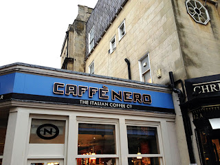
They wanted a minimalist, modern design and in the first instance were after just a simple logo idea. I headed into town to take photos of successful coffee house brands:


I am not actually too keen on most of those, although I do like the style of The Cosy Club. I jotted down a few quick ideas in my sketchbook:


I then played around with lots of cheesy visual puns, usually involving actual wings (yuck) and more often than not with some kind of arrow pointing to the right, signifying "east". After a few fruitless hours of doodling I came up with this:


I think this has the right sort of upmarket feel that they are after. I mocked up a few images of the logo in use:


While I was in town researching coffee house branding, I stumbled across this fantastic sign:


I am sure that the "e" is not supposed to be hanging down like that, but it really fits with the name "Pretty Eccentric", don't you think?

Wednesday 17 October 2012

Cover to Cover - David Pearson

The second speaker at Cover to Cover was the brilliant David Pearson. I am a huge fan of his work, particularly for Penguin Books and really enjoyed the talk he gave at uni when I was in the first year. The thing I really like about David is that while his work is often great, he is in no way big-headed about it, often coming across as almost apologetic about his undoubted ability.

He is really passionate about the history of penguin book covers and considers himself extremely lucky to have worked with them straight after graduating. One thing that I found especially interesting is that he didn't actually do some of the covers he is best known for, like these:


These were both done by Phil Baines, who was actually one of David's tutors. He was very honest about this but I had always assumed that he had done the artwork himself. Of the ones that David did actually do, I noticed that he has a real fondness for using rubber stamps, embossing and other fancy craft techniques, rather than relying on solely digital techniques. I must do more of this sort of thing myself as it really adds a layer of quality and shows an attention to detail. The only problem is due to material costs, meaning the design better be spot on before spending money on an embossing plate!

So it would seem that David is primarily some sort of art director, as he often gets others in to do the art/typography. I can definitely see myself in a similar role at some point, especially as I now know a whole bunch of brilliant illustrators from my course. I would definitely like to be hands-on with the design wherever possible too though, and not just the guy who goes to meetings.

Speaking of which, David gave a useful tip for when you take work to show your boss or a client; take three designs along, make sure two of them are totally inappropriate/offensive and more often than not they will be so relieved to see the inoffensive third option that they will sign it off. Nice idea.

Cover to Cover - Teresa Monachino


Yesterday I attended the Cover to Cover talks at the Arnolfini, organised by the West of England Design Forum. I have already seen great lectures by the two speakers - David Pearson and Teresa Monachino - but as I found them really useful I figured it was worth getting out and seeing them again. I also thought it would be good to show my face at a WEDF event. It certainly helped that Teresa put a few of us on her guest list - she was one of our tutors last year!

Teresa was up first in front of a sell-out crowd, and she began by talking about "the designer as author", showing a few pages from her Really Boring Colouring Book (which she gave me a free copy of last year). It's a nice book and certainly something of the sort of standard I would hope to achieve in my projects this year, in terms of concept and execution. She then moved on to her Around The World With The Bodoni Family, another nice project but one that surely would only be appreciated by other designers. Apparently it was printed using letterpress by the Society of Revisionist Typographers and as such cost her a hefty £68 each to make! The Design Museum took 40 copies and sold them at £95 each.

Her more modest Words Fail Me was next and it was really great to hear that it has been picked up and serialised by Private Eye magazine. At this point Teresa took a moment to express her dislike of the regular "Bookalikes" column in Private Eye. In it, they poke fun at people who produce generic book covers that often completely rip off the work of other designers. She defended these light-fingered designers by suggesting that they were probably working with no budget. That is not a valid excuse in my book (pun intended), as good, original design does not have to cost anything. I think she may have had a different opinion if my publication project last year was a copy job.

She then went on to show some good examples of book cover cliches, pointing out that obvious solutions for certain genres (chick lit, historical, thriller) are often best. I do agree with this, as the reader often wants to know what kind of book they are getting at a glance. It's all about appropriateness in design, something I am hearing a lot about lately.

One of the most valuable lessons I got from Teresa, which she mentioned again here for the benefit of all present, was that when designing book covers you should run off mock cover ideas, then put them in situ in a nice little book store and look to see how they compete for attention on the shelf. The design should sit well with the others in the same genre while at the same time having the biggest impact. This can be achieved through colour, typography and format (as well as actual positioning on the shelf). This is something I will definitely try with my next publication. Perhaps I will bump into her at Mr. B's.

Sunday 14 October 2012

Dissertation - Let's get this straight...

I have spent the summer working my way through a pile of books in preparation for writing the dreaded dissertation. The full first draft is to be submitted on November 30th and thus far I have written nothing. This concerns me greatly. I don't want this to start getting in the way of my studio work, after all this is the final year and I want to make some work I am proud of, so I really need to make a start. The problem is I am not entirely sure what I am writing about any more.

The title of my essay is Have Graphic Designers Lost Their Sense of Humour? At least that hasn't changed. So, on the advice of my tutors, I am hereby going to vomit all I know on the subject onto this page, so I can start to figure out where to take it. Here we go...

There are many great examples of humour and wit in graphic design. Most of them can be found in the book A Smile in the Mind. The legends of witty design include Paul Rand, Saul Bass, Milton Glaser, Alan Fletcher and Bob Gill. I am a big fan of the work of Rand and Bass, while I am actually struggling to find much in Glaser's work that can truly be regarded as witty. Alan Fletcher had an irreverent approach to his work and some of his designs are very clever indeed, while not especially beautiful (in general - there are exceptions). Bob Gill seems to focus primarily on the idea, or solution to a design problem, yet fails to deliver in terms of aesthetics. He is the extreme case but I think all of these great designers can be classed as "ideas focused".

So why were all these designers consistently churning out witty or humorous work? I have plenty of useful quotes from Freud's The Joke and it's Relation to the Unconscious that explain how humour can be used to 'sugar-coat' a message, opening up the audience and making them more receptive. Let's not forget that graphic design used to be primarily about selling products and, to a lesser extent, ideas, so a receptive audience is precisely what the client would be after. There are also numerous studies that show how an audience likes to be given only part of the message, as they take pleasure from filling in the gaps themselves. This has been described as the designer 'throwing a ball for the viewer to catch'.

We have all seen adverts, either static or on TV, that have initially confused us. The bad ones leave you in that state, totally unfulfilled, whereby a well-designed advert will eventually be understood by the majority. At that moment, when you get the joke or second-meaning, your reaction is usually positive - you will most likely smile, acknowledge the wit of the designer (and the company making the product that is being plugged) and then tell your friends about it. Viral marketing before the term became commonplace. So there's no doubt that wit and humour can be used to great effect (I must also attempt to clarify once-and-for-all what I mean by the terms 'wit' and 'humour' in respect to graphic design).

In the 80s and 90s, good examples of real wit become harder to find. I personally think this is because graphic designers started to take themselves too seriously. Can I prove this or is it just my opinion (based on what?)? Well, I suppose the big names in witty design were old men (or dead) and so their brand of design, of which humour was a large part, was regarded as old fashioned and thus undesirable. Also, the 'First Things First' manifesto signalled a change in attitudes, whereby designers wanted to be more than just salesmen for products they either despised or couldn't care less about. I personally think that branding is a perfectly acceptable career path - I would love to redesign the McDonald's logo; it's the parents shoving this crap down their kids' throats that are the problem. And then of course there was the Apple Mac.

Obviously, this was a big, big problem for many designers as the tools of the trade were now available to all and sundry, regardless of their talent, education or technical training. This is of course a good thing in general and there are countless fantastic designers with no formal training - Behance and Deviant Art are testament to this. And let's not forget that these new tools were also of substantial benefit to the professionals. But obviously this was a tough time for designers as design had been democratised and they now had to justify charging proper money for their expertise. Perhaps this is why a lot of the work coming out in the 80s was so obviously informed by a solid grounding in art history. Think David Carson and Neville Brody.

Ooh, that nutter is about to jump out of a balloon at 120,000 feet! I need to see this live just in case his brain melts when he breaks the speed of sound...

Where was I? Okay so I will need to find a few really good examples of 80s and 90s design that really show how humour and wit were less prevalent at this time. These will need to be properly analysed so I can prove how designers were referencing other, more 'artsy' things in their work. Perhaps some of the postmodern 80s stuff would be good for this purpose, at least as a starting point. I think this section may well be a major part of my dissertation, as I think that it was during this period that design underwent the most significant changes. Adrian Shaugnessy's How to be a Graphic Designer, Without Losing Your Soul has a good section on this time. It also covers the problem of 'crowdsourcing'.

Finally I would like to take stock of the current trends in design, as I believe wit and humour are on the rise again. I will cite the work of James Victore and Stefan Sagmeister, among others (to be decided), while also exploring how the term 'graphic designer' is perhaps becoming redundant - it covers too many disciplines, such as illustration, typography, type design, photography, animation and web design.

I think that pretty much sums up my thinking thus far on the topic. I hope this little exercise has gone some way towards getting it straight in my head so I can actually get on and start writing! And that bloke still hasn't jumped out! Bet he is shitting himself...
Friday 12 October 2012

Then & Now - An actual good idea!

During my tutorial yesterday I managed to stumble across a way of combining my retro pattern and political statement ideas. I bemoaned the fact that if I were to strip the text from my Don Foster posters (see previous post) and put them up at college, hardly any of my fellow students would have a clue who it was or what I was angry about. Mental.

I always had the impression that art school was a hotbed of political/philosophical discussion, activism, attitude and individuality. People used to be fired up about some cause or other and used their creative skills and time and energy to do something about. Sure, back then there was Vietnam, Korea, social inequality, sexism, racism, loads of other isms. And now what do we have? Afghanistan, Iran, Iraq, Libya, Syria, social inequality, sexism, racism...

Why are art school students not bothered about this stuff?

They are more interested in drawing owls, getting the latest iPhone and making sure all their clothes are the same as everyone else's (Jack Wills, Hollister, Urban Outfitters). It's all just consumption. So then I got the idea of somehow representing these two different eras of consumption.

Back in the sixties and seventies, students were consuming ideologies and now they consume brands. I am thinking about making two cupboards that I can fix on the walls. The first, "Then", will contain tins, jars, etc. all branded in a sixties/seventies style (think Jonny Trunk's Sainsbury's Own Label book) but instead of saying "soup" or "beans" or "coffee" they will say "activism" or "Marxism" or "equality". I will need to research and think about what these actual words will be, but you get the drift.

The other cupboard, "Now", will contain a bunch of stuff branded in a recognisably modern style (this needs researching) and will have banal consumerist slogans on them, like "latest Apple product", "X-Factor", "celebrity", etc. I will need to do some research and nail exactly which words to use.

So the final piece will be an installation but I will also take some of these mock products into the photography studio and get some beautiful shots that can be made into posters. Yes. That is what I shall do.

Wednesday 10 October 2012

Then & Now - Don Foster

Here's the Don Foster idea. It will need some working up but I think it will be quite striking at A1 poster size. First is Don 'Then', followed closely by Don 'Now'...


It feels good to be political again. And if you are a student who doesn't get this, you seriously need to WAKE THE FUCK UP!

Then & Now - Tangents

I feel the need to think differently about this project for a while. I just watched the James Victore talk on the Do Lectures site and thought I would try his approach - pick something that actually matters, fuck the visual, that's not the important bit. Well, actually the impression I get is that the final piece needs to hang together as a piece of visual design, but don't get hung up with the smaller details of typography and colour.

So I was thinking about politics, which is something I actually give a fuck about. How can anyone not give a fuck about that? Anyway, sticking with the 1972 - 2012 timescale I thought that there must be some important parallel that I could draw. How about the fact that all the politicians in 1972 were fucking assholes and in 2012 they still are? Because they are. They are a bunch of self-serving egotists who make ridiculous decisions that are not for the good of the people they serve. Maybe they should actually serve the people, by working in Starbucks or McDonalds. Of course Obama has done stuff like that, as a publicity stunt to show he is a man of the people.

Perhaps I could do a poster of Richard Nixon, daubed with the slogan LYING FUCKING ASSHOLE. Then I could do one of Barack Obama with the exact same slogan screenprinted over the top.

That could work visually. Then there could be a tiny bit of text at the bottom with the statistics to back up my opinion. That shouldn't be too hard to research. Just show the pre-election promises followed by the ones that they actually pushed through.

How about a poster of Don Foster, our very own MP. He is very different between Then and Now. Then he said he would absolutely not vote for an increase in student fees. Now he fucking well went and did exactly that! I am going to make these posters anyway...

Tuesday 9 October 2012

Then & Now - 70s wallpaper!

The more I think about the seventies, the more I reduce it to a nasty colour palette combined with repeating geometric shapes. I guess my earliest memories are of crawling around on hideous carpets, whereby I was practically engulfed by these clashes of predominantly brown, yellow and orange. There is something sinister about them, yet I feel very nostalgic for them at the same time. I decided to play around with these forms in Illustrator for a while...


I think these patterns would look great screenprinted. I would like to do them as A1 or A2 posters, maybe with some secondary text elements on them, like this:


I've used HelveticaNeue Ultralight for the "Then & Now" and the oft-mocked but very seventies Hobo for the year. I will need to play around a bit to get it right - with so few elements they simply have to be spot on.

And I just had a brainwave regarding the "big" and "small" outcomes... how about printing one of these patterns on a roll and papering a wall in the exhibition space? Steve said he can print up to five metres on a roll (although it will probably have to be from a PDF as Photoshop/Illustrator won't let you create artwork beyond about 2.5 metres apparently). If I measure the floor-ceiling height of the exhibition space I can get a few rolls printed out. That's the big outcome, perhaps for the small one I can screenprint a poster to go alongside, with the name and year details, as above.

Okay, so that was "Then", what about "Now"? In terms of wallpaper, these days people are going for pretty extravagant designs but then only applying them to a feature wall. For the poster I could divide the space, maybe in faux 3D and add the modern pattern to just one area. That might work. Not sure what I will do for the big outcome. I will also have to think about a suitable typeface that says "Now".

Monday 8 October 2012

Then & Now - Early experiments

Keeping with my 1972 - 2012 theme, I have knocked up a couple of poster designs that I may or may not want to go with. The first design is very Swiss, as you can see:


Okay, so it's not the garish wallpaper design that I was going on about last time, but I had this other, cleaner design that I think may have legs. The idea here is to have two sets of silhouetted icons, showing design classics from 1972 (or the seventies in general) and 2012. I have done a couple already, as you can see, like the spacehopper and lava lamp. I have plenty more ideas for 1972, including a fondue set, the pocket calculator, Pong (the first videogame), Snoopy and those stupid little Troll characters. 2012 may be more of a problem. I have done the Plumen bulb, and I guess I could add an iPhone, iPad... most things seem to be small rectangles these days. Maybe that's my point.

The other design is focussed more on the shapes and colours I associate with the period:

I think this design would look lovely screenprinted at A1 or A2. It would be nice to experiment with the colours to see how the blend works on the overlaps. I will definitely print this poster at some point, even if it is not the design I end up going with for submission.

Then & Now - Research

Seems that in my initial thinking I was overlooking a pretty significant event that could make my work very different to everyone else in the year - I am unfortunately turning FORTY this November, so I could surely do something based on how things have changed between 1972 (then) and 2012 (now).

What were the seventies really like? I remember them to be mainly brown, orange and yellow. And bleak. There was a real sense of general gloom in the seventies. And a general weirdness, perhaps some sort of global acid comedown after the sixties. That would explain some of the horrific TV shows of the time, especially The Banana Splits and Animal Kwackers.

But my enduring memory of the seventies is definitely of the garish colour schemes, particularly the wallpaper and carpet patterns. This is an area I would like to explore for the project. I think some of the old designs would look really nice screenprinted. Perhaps I could do a couple of images, showing how pattern design has changed, if indeed it has. Maybe it has come full-circle. Certainly in terms of wallpaper design you can see some of retro patterns making a comeback, only now they are used sparingly on 'feature walls' which makes them less overwhelming. Here are a few designs that really typify seventies design for me:

These would look great screenprinted (and I need an excuse to get back into that anyway). I will have a go at knocking up a few designs, then try to figure out how to execute them...

Then & Now - Initial thoughts

Despite being up to our eyeballs in dissertation right now, we have been set our first project for the year. The title is "Then & Now" and we need to produce two outcomes; one 'big' and one 'small'.

Okay, so what are my first thoughts on the subject?

Something that has changed over time


I am reading a great book about the moon landings at the moment called "Moondust". This got me thinking about the primitive computer technology that was used to put man on the moon. How does this compare to the processing power in my mobile phone? I assume not very favourably. So there's one train of thought. Not quite sure how to make something visual from that, but that's not the point at this stage.

Fashion. Yeah, this has changed over time, obviously. Problem is I am not particularly interested in it as a subject.

One idea I had over the summer that would fit this brief is to do with football (and fashion actually). I was thinking about how you rarely see a player wearing black boots these days, whereas in the past there was no other option (okay, apart from Alan Ball's white boots). Perhaps I could do screenprints of team line-ups for big matches throughout history, where I use little boot icons to represent each player on the pitch. The boots would be coloured to match the ones worn by the player during the match.

So for the 1966 World Cup final, all the boot icons would be black, except for little Alan's. If I did one from let's say Argentina 1978, most of the boots would be black, apart from maybe the Argentine playmaker or winger, who would probably have had white ones. A similar image from the Euro 2012 final would be utterly bereft of black boots, with the majority being luminous orange, lime green or pink. Even the bloody centre-halves!

Another thing that has changed markedly over time is our consumption. How about a pair of images that show the sheer volume of brands we are consuming these days, compared to different points in history? Could be visually interesting and makes an important social statement.

How about the relative value of celebrity Then & Now? Look at the first Hollywood superstars and how they had true class and compare them to today's X-Factor 'celebs'.

Something that combines both the past and the present

Not sure what I would be saying with this, but I am thinking that an image of dinosaurs wandering around modern Bath/London/New York would look pretty cool.

Something which is both Then & Now. A timeless classic that hasn't really changed


  • VW Beetle
  • Vespa scooter
  • Helvetica!
  • Converse All-Stars
  • London black cab
  • London Underground map
  • Raybans
  • Brogue shoes
  • Braun products (Dieter Rams)
  • Fender Stratocaster
  • Gibson Les Paul
Other ideas from different parts of my brain

Olympic branding Then & Now. Compare and contrast the awesome Otl Aicher designed Munich Olympics of 1972 with the dreadful pink splats that Wolff Olins knocked up in their lunch hour for London 2012. Another angle would be to look at what happened to the Olympic infrastructure after the circus had left town. What became of the amazing stadium in Beijing? I remember seeing images of derelict stadia left over from the 2002 World Cup in Japan and South Korea. What a waste!

While stuck in traffic on my way home from uni the other day, I got to thinking about how traffic density has ramped up in Bath over the years. How could this be explored and represented visually? Where could I get the data? It would be nice to present this graphically for any number of cities around the world.

How about air traffic density over the UK? This would have an important environmental message and could look striking visually. This needs to be explored...

Another idea I had was to do a series of Then & Now photos to show the extent of damage (and damage that is still visible) from the Bath Blitz in World War II. I would personally love to research this and I find it quite eery when I see the shrapnel damage to some of the buildings in the city centre but unfortunately I think this subject has been done to death. And it is a bit too obvious.

And so back to football

One final idea on the football theme - how about a piece that documents the change in the design of footballs used at major tournaments? I could do a book shaped like a regulation size five football, with vector illustrations of all the balls (should be able to find enough reference material online) and snippets of trivia on the other side of each one - things like tournament top scorer, most assists, controversy surrounding the ball at the time (too bouncy, floaty, swervy, etc.).

Wow. That was a long first blog post for the third year.