Today I had the opportunity to get some feedback on my portfolio from Bob Mytton, founder of the Mytton Williams here in Bath. He was impressed with my football chant hymn book, especially the core idea, although he stressed that I should push it as far as possible to make it look as much like a real hymn book as possible. He was also very positive about my 'Swearing Budgies of the World', although he struggled to see how it could be applied commercially. It made him smile and it was memorable, in his opinion, which is definitely a good thing. I pointed out that the famous 'Meerkat' TV ads must have been a hard sell but they have been wildly successful.
At this stage my portfolio was not presented very concisely. I took along an A1 portfolio case, an A2 one, an iPad and some books in a carrier bag. Bob commented that this didn't look very professional, which I knew and agreed with, and I know I have to do a lot of work to get my work presented in the best possible way. He said I should produce a PDF portfolio, as well as something I can show on the iPad. Any printed work should be consistent in size so perhaps I can put it all in the A2 case. It's a much more manageable size to carry around ad open out on a desk.
Looking at how some other people presented their work, I realised it would be really useful to put together a portfolio guide for the iPad, and probably also a PDF that can be emailed. For each project I need to have a little bit of text explaining the brief, my concept, the execution and my conclusion. This should be backed up with nice images showing my design - Bob made a point of saying that we should use big images, let the design breathe instead of cramming too much on one page/screen. This is especially true with screen-based outputs as pages are free. He said that you should aim to have around eight projects in a professional portfolio - stick the best two at the front and another strong project at the back, filling the middle with the rest.
Bob then told us that we should always try to visualize how a project would work as a complete campaign. I have done some of this in the past, showing designs in their real-life contexts (using Photoshop trickery). When working on a branding campaign, try to see how far you can push it, especially in terms of sub-brands so it looks like a considered and well-rounded campaign. He finished by saying that prospective employers want to see three years' worth of quality work, so I will include my strongest projects from the second year too.
I found this exercise very useful and would really like to do a work placement at Mytton Williams. After hand-in I will work on a couple of good branding projects and then contact Bob.
THIS IS THE BLOG OF ANDY ASHWIN, THIRD-YEAR GRAPHICS STUDENT AT BATH SCHOOL OF ART & DESIGN. I'LL TRY TO UPDATE THIS ON A REGULAR BASIS WITH MY THOUGHTS, WORK AND LINKS TO STUFF THAT MAY ONLY BE OF INTEREST TO ME.
Tuesday, 30 April 2013
Friday, 19 April 2013
Networking Workshop
Today we had a networking workshop with John Hector from Spike Design. A lot of what he told us was common sense, although it was worth noting down a few of the organisations that can offer help to people in the creative industries. Bristol currently has a vibrant design sector, centred around Stokes Croft, Paintworks, the Watershed and Spike Island. Bath is sorely lacking at present but perhaps that presents an opportunity, plus Bristol is not far to go for a bit of help.
John stressed the importance of keeping up-to-date with local industry bodies, such as Spike Design and Design South West. He also mentioned the West of England Design Forum, who run a series of professional lectures and workshops from the Arnolfini in Bristol. I will sign up to e-bulletins from all of these places to ensure that I am not missing out on any opportunities. Obviously, showing your face at these kind of events can lead to work or project collaborations. Other useful organisations include Creative & Cultural Skills and the Design Council.
He told us to be curious, keeping up-to-date with other designers' work, in the area (in direct competition) as well as on a more global scale. It is clear that I need to conduct some more serious research on the design sector, so I can figure out exactly where I fit within it. What do I like? What am I passionate about? What am I good at? These are all questions I should be able to address when I have a bit of time after final hand-in.
When it comes to actual formal networking events, John told us that planning is key and that you should figure out what you want to achieve. Who's in the room that you want to speak to? If you get to speak to that person, make sure you say something memorable. Get a business card and follow up the next day with an email. Also, it is vital to rehearse the answer to the question "what do you do?". I currently don't have a satisfactory answer to this, certainly nothing more vague than "graphic design", whatever the hell that is!
Social networking is something I need to learn how to use properly, from a business perspective. It seems that many businesses are using Twitter in particular to get work, as well as getting known to the design community by blogging about conferences and exhibitions that will be of interest. I need to look at how my favourite local/global design studios use social media effectively and try do something similar. This is something else that I can research in earnest after hand-in, unless I can find the time before.
One thing that keeps coming up in these events is that you need to make a massive initial impact. It seems obvious but it's amazing how many designers send a CV or letter out that isn't really designed, or even checked for typos! I know I have nothing to worry about regarding the latter, but I should definitely think about producing a beautiful piece of print design that will stand out from the rest. Perhaps I can create a CV that folds out into a massive A1 poster or something...
Thursday Lecture - Pat Starke

Yesterday's guest industry lecturer was Pat Starke, creative director at Design Activity in Bristol. He wore his belt buckle in a jaunty manner, almost on his right hip, which was a bit strange. Creative types, eh? He had my attention.
He told us that he was from Aldershot and that, upon graduating, he took up a role in a really good small studio where he learnt his trade. Ambition eventually drew him to London where he worked for a pretentious studio with a classic wanker boss. Pat told us that there is no need to be an arsehole when you are boss, which is something I totally agree with. I have worked for them in the past and it is obvious that a culture of fear and intimidation is not conducive to good work. He also said that he does not work late, as a matter of principle. Life is too short and there are plenty of other things he wants to do. Again, I find this attitude refreshing. I used to work in the games industry and we were expected to do insane amounts of unpaid overtime, even when we were on schedule. One producer even offered to give me some pointless work to do, so that I would get behind and have to do overtime to catch up, just so it looked good on the boss's spreadsheet!
I fully expect to put in the hours when a deadline approaches, or if you get an unexpected opportunity to pitch for a huge client and time is of the essence - that is absolutely fine and I know that "going the extra mile" makes a good impression, especially when you are starting out.
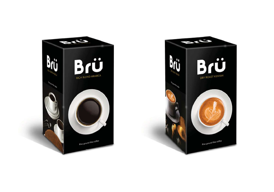
Pat then went on to show us some of the work he has done over the years. It was all really high-quality branding/packaging stuff for some massive clients. One interesting tip he gave us was that when working for a corporate client, show them a range of concepts, from conservative to completely mental. You'll be amazed how many times they will choose the latter, or ask for something in between. What I found really interesting was the rebranding work he did for Bulmers when they introduced San Miguel to the UK market:

The bottle on the left is the original one sold in Spain. The rebrand is incredibly subtle although in many ways I actually prefer the original. It just looks classier. He said it was important on jobs like this to look at the history of the product and to use iconography that fits, which is why they kept the ship from the original. They also added a crest that looks very similar to the Barcelona FC badge to the UK product, probably to make it look more instantly Spanish.
He then showed us the work he did for Agnelle gloves. These are a premium product from France and he was packaging them for the US market. There were a number of different ranges that needed branding, from the top-end couture gloves to the cheaper sports range. Each needed to packaged accordingly. He said rather than researching what it is to be French, it was important to base everything on the US perception of France. Makes sense. I like the mental bag design concepts he did for the top-end product:

Next was quite a long story about his relationship with The Fabulous Bakin' Boys, who make a range of muffins and flapjacks, etc. I have never actually like their packaging - it looks like a cheap stab at Americana and I just don't think it works. It's never made me buy any of their products, as I assumed they would taste cheap and artificial (which is maybe why I often see them half price in Sainsburys).

My tastes aside, the point he was making was that it was important to develop relationships with your clients - only when you really get on with each other can you produce great work. He also made the point that despite their relationship being so good, they were eventually dropped by the client. You need a thick skin in this industry.
I really liked the packaging and logo designs for both Le Canard Et La Lune and Savse Smoovies and would definitely be tempted to buy them if I ever saw them in the supermarket:


Pat then talked about how Design Activity will regularly approach a large successful company with ideas for new product ranges. The idea is that they may like the idea and want to go ahead with it, based on the awesome packaging designs. Or they may just remember you and admire your proactive spirit, which could stand you in good stead with them in the future. Or they may just nick your ideas and do with them what they will. The latter is of course a risk but in Pat's experience most folk are decent human beings. He said that if nothing comes of one of these projects, at least you have more good stuff to add to your portfolio to show other clients. I think it is a brilliant idea. I also want to get the Photoshop skills to mock up products like this:

He finished by giving us some tips on getting a job:
- Plan your route. London? Stay local?
- Understand the competition (fellow students).
- Research your targets. Look at their work. Find the name of the creative director and write to him directly. Talk about their work as well as yours and try to do something memorable.
- Make contact with them. Ask for portfolio advice. Most people appreciate how hard it is (they have been there themselves remember) and will offer help.
- Polish your portfolio. Fill it with ideas, quirkiness and practical considerations.
- Persist!
Wednesday, 17 April 2013
Hymn Book - Development
I have now got all of the chants chosen for the book. The finished piece will be a proper hardback comprising stitched sections of 16 pages, so I have opted for a total page count of 208, which is divisible by 16. This includes the contents etc but not the endpapers, as these will be added at the end as part of the binding process. I compiled most of the chants from various websites and these two books which I bought from Amazon:
.JPG)
The content is divided up into teams, although a lot of the chants are either generic or there is only one decent one for a certain team. In this case I would not add that team to the contents page, instead they will go into the "OTHER" section. I am not particularly happy that the "OTHER" section makes up pretty much half the book but I can't really see a better way of doing it.
I have also decided to move the hymn numbers away from the hymn itself and place them consistently up in the corner of the page, in 12pt Joanna. Beneath each hymn I have the tune it was based on, in brackets in Joanna 6pt italic, with a one-line space above. Above each hymn, where applicable, I will have the name of the person or team the song is about, if it is not obvious from the lyrics themselves. This will be in Joanna 6pt italic with a one-line space below, and will take the format of "unto [team or player name]".
I really liked having verse numbers next to all but the first verse but I don't think it is practical as nearly all the chants have only one verse. Very few have more than two verses, so it may look a bit odd having them at all. It's a shame as it is a hymn book convention and would serve to make this look more like a real hymn book.
This is the finished page design:

Thursday, 11 April 2013
Hymn Book - Page layout test
Looking at various hymn books, I noticed that they typically had hymn numbers as well as page numbers. I decided to add these to my template. They are set in Joanna MT Std Bold 12pt and positioned directly above the first word of the first verse. The first word is always set in small caps (apart from the first letter, which is a regular cap), as they are often found in hymn books. Also, all verses after the first one are numbered. The number is just Joanna MT Std Bold 6pt followed by a space.
Here is an example of how a finished hymn might look:

The text for the entire hymn is centre-justified and centred on the page. The hymn number is then positioned relative to this.
Here is an example of how a finished hymn might look:

The text for the entire hymn is centre-justified and centred on the page. The hymn number is then positioned relative to this.
Hymn Book - Typography tests
I set up an InDesign template for my football hymn book. It is slightly larger than the "Songs of Praise" book I have been using for reference, with a page size of 86mm x 120mm. I printed a few sample pages, set in classic serif typefaces - Minion, Times New Roman, Perpetua, Baskerville, Garamond and Joanna.
My favourite is definitely Joanna. It is very light and elegant, perfectly suited to a hymn book, and I have it in a number of weights - regular, italic, semibold, semibold italic, bold, bold italic and extra bold.

My favourite is definitely Joanna. It is very light and elegant, perfectly suited to a hymn book, and I have it in a number of weights - regular, italic, semibold, semibold italic, bold, bold italic and extra bold.

Wednesday, 10 April 2013
Branding - Business card ideas
Following on from my logo ideas, I just designed a simple business card, two versions of which can be seen below:


There are loads of other things I want to try but this is a start.


There are loads of other things I want to try but this is a start.
Branding - Logo Development
While I was working on the Bath Uni science brief, I became a big fan of our customised DIN Pro font that we used on the big stencils. I particularly liked the "A" and figured it might look good if I used it as part of my AA72 branding. My current logo looks like this:

It's set in a very heavy weight of Gotham, with tweaks to the As. I think it is perhaps a bit too chunky for my liking. Here is an idea using the A from the stencil:

I am not totally convinced. I was thinking it might work with a splash of colour but at the end of the day a logo has to be able to work in black and white too. I thought I would also try a few ideas using my other 'font du jour', T-STAR PRO:


I reckon I will have to do a bit more research and come back to this later. Some of them are okay though.
It's set in a very heavy weight of Gotham, with tweaks to the As. I think it is perhaps a bit too chunky for my liking. Here is an idea using the A from the stencil:
I am not totally convinced. I was thinking it might work with a splash of colour but at the end of the day a logo has to be able to work in black and white too. I thought I would also try a few ideas using my other 'font du jour', T-STAR PRO:
I reckon I will have to do a bit more research and come back to this later. Some of them are okay though.
Bath Uni - Poster designs
I have been struggling to come up with a satisfactory poster design for a little while now. Basically I wanted a simple template that could be used for four A2 posters, one for each of the four areas covered by the Bath Uni brief:
As it happens, I came up with this rather nice design using a subtle orange gradient, so I may print them digitally instead:


If there is enough time, I will still try to screenprint a bunch of these. Problem is screenprint will be insanely busy from now until final hand-in, plus getting Steve to print the artwork onto transparency will also take forever. It might be best to do them digitally for hand-in, then do the screenprints afterwards when things have died down.
Once the posters are printed, the only remaining tasks for this project will be to screenprint the t-shirts, labcoats and the sheet that will go over their tables. And the stickers that will go on the paper coffee cups. Again, if there is time I may put a simple website together where people can go to get more information than can be printed on the leaflet and posters.
- Element Scarcity
- Attitudes to Chemicals
- Fuels for the Future
- Bioplastics
As it happens, I came up with this rather nice design using a subtle orange gradient, so I may print them digitally instead:


If there is enough time, I will still try to screenprint a bunch of these. Problem is screenprint will be insanely busy from now until final hand-in, plus getting Steve to print the artwork onto transparency will also take forever. It might be best to do them digitally for hand-in, then do the screenprints afterwards when things have died down.
Once the posters are printed, the only remaining tasks for this project will be to screenprint the t-shirts, labcoats and the sheet that will go over their tables. And the stickers that will go on the paper coffee cups. Again, if there is time I may put a simple website together where people can go to get more information than can be printed on the leaflet and posters.
Hymn Book - Further thoughts
After discussing my hymn book project idea with one of my tutors, I have decided to pursue the original plan of filling it with football chants. I think the line about football being like a religion is the clincher, plus using the format of an austere old hymn book filled with often obscene lyrics is too good to pass up.
I managed to get hold of an old hymn book from my parents' house:

I will look at other examples, so long as I don't spontaneously combust upon entering a church, but I do really like the idea of this sort of format. It is pretty small, measuring approximately 75mm x 115mm, so I can imagine it may be quite tricky to sew the sections together. Speaking of which, I must remember that the number of pages must be divisible by four - each section will consist of four double-sided spreads, or sixteen pages. I just hope I can find enough good football chants to make it a thick book, at least thick enough to have a substantial spine.
I want it to be case bound, using cardboard covered in some kind of cloth, which I will then screenprint on the cover and spine. I am not sure if I should make the cover up prior to printing or just print onto the cloth. If it's the latter I will do a few copies in case I make mistakes with the binding. I will research binding techniques over the next day or so, plus chase up our course leader to see if we are getting another bookbinding workshop.
Typography-wise, I want it to look as much like an old hymn book as possible, so I will probably opt for a classic serif font like Garamond or Baskerville. I will obviously do a few legibility tests at small sizes first, probably at 6pt.
On the cover I will have an image of a football, or maybe one of those old spinning rattle things that people used to take to matches. The title could be "Songs of Praise" or maybe something like "Hymns from the Terrace".
Bath Uni - Leaflet redesign
After my recent visit to Opal Print, it became apparent that I would need to redesign my science leaflets if I wanted them printed at a sensible cost. I was told that the five-panel concertina design could have a maximum width of 430mm, making a max page width of 86mm. A page height of 103mm max would allow three leaflets to be printed per sheet.
I rejigged the format to these specifications but decided it looked a bit squat. As it would only be marginally more expensive to print two leaflets per sheet, especially at such a low run (250 or 500 to start with), I also did a slightly taller version with a page size of 86mm x 120mm.


I think that this intermediate size (to the right in the photos) is the most suitable. I also had to bear in mind that a minimum font size of 8pt was recommended by Opal, due to the fact the the text is white out of an orange background.
I showed the two new formats to the Bath Uni guys this week and they seemed happy with my decision to go with the taller version.
Tuesday, 9 April 2013
Visit to Opal Print
Yesterday I drove over to Opal Print in Midsomer Norton to check out their facilities and see what they had to offer. We had met a couple of guys from there a few weeks ago when they visited uni to show us their stuff and I was very keen to see their huge litho press in action.
As soon as we arrived we given refreshments and invited to look at some of their latest work. I was particularly impressed with this architectural document, which was something like A3 format and used a new type of "lie flat" binding:


Another really impressive publication was this one for a company that leases private jets:


The editorial design of the pages wasn't particularly exciting but the level of finishing was. The book was bound in a white faux leather, that we were assured was at least as expensive as the real thing. It was softer than any leather that I had ever felt. It was then presented in a beautifully-crafted box, which Opal farm out to a specialist craftsman. Turns out that each of these books costs about £100 to produce, which is fine when you consider the market that they are in. I guess they would only give them out to people who have a genuine interest in leasing a jet though!
After drooling over these fancy books, we were shown around some of the amazing kit that Opal use. First up was the machine that turns artwork files into aluminium lithographic plates:


I must say I didn't fully understand the process to begin with but they were kind enough to make up some plates and talk us through it, step by step. It amazes me how fine a print they can produce using the seemingly primitive principal of water and oil repelling each other.
Next we were taken down the shop floor proper, where the massive print machines chugged away:


This beast had six separate elements - one each for C, M, Y and K, one for spot colours and one for special finishes. We were told exactly how it all worked, and it was fascinating, but I will not go into detail here as I am sure all the information is freely available online. Suffice to say it was fascinating to see how each litho plate was put onto a roller, then the paper whizzed through from the far end, getting inked by each of the colours in turn before popping out in beautiful full-colour at the other end.


We were then shown around some of the other amazing machines, including this beautiful old press that they still use for die-cutting:


Back in a quieter part of the building, we saw the machines that were used for creasing and saddle-stitching (stapling), as well the foil blocker and laminater. Basically all the fancy stuff that I would like to use on every job but will rarely be able to afford!
After our tour we went back to the office and I got the chance to spec out a few jobs that I required quotes for. It became abundantly clear that you really need to involve the printer at the very beginning of a project. It turned out that the concertina leaflets I had designed for the Bath Uni science brief were too long to be printed digitally at Opal (I think their max page size is B3). Printing them litho would probably be too expensive so I will need to rejig them to make them fit.
Subscribe to:
Posts (Atom)