They wanted a minimalist, modern design and in the first instance were after just a simple logo idea. I headed into town to take photos of successful coffee house brands:


I am not actually too keen on most of those, although I do like the style of The Cosy Club. I jotted down a few quick ideas in my sketchbook:

I then played around with lots of cheesy visual puns, usually involving actual wings (yuck) and more often than not with some kind of arrow pointing to the right, signifying "east". After a few fruitless hours of doodling I came up with this:

I think this has the right sort of upmarket feel that they are after. I mocked up a few images of the logo in use:


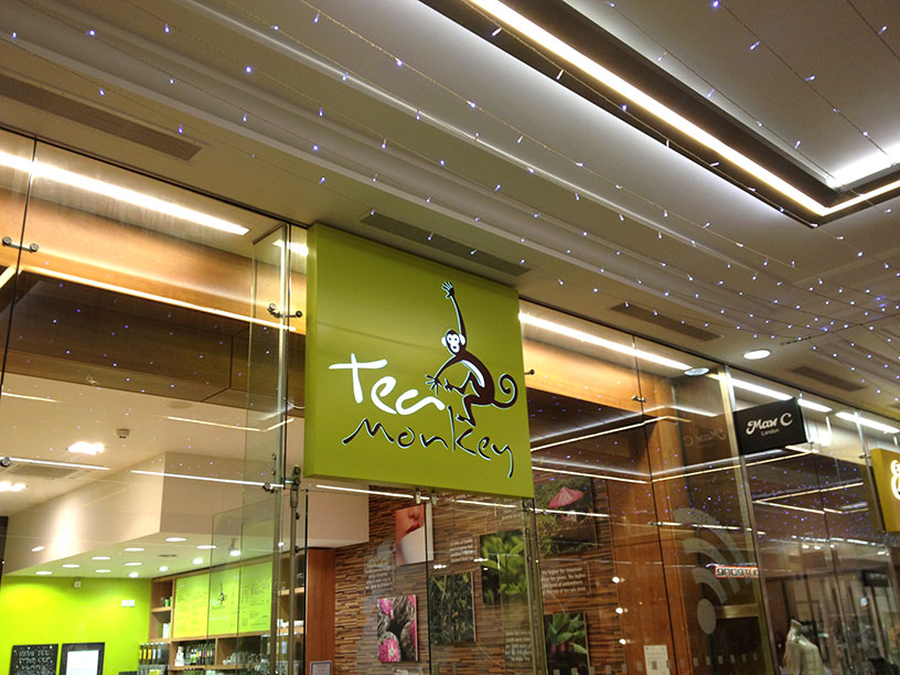
While I was in town researching coffee house branding, I stumbled across this fantastic sign:

I am sure that the "e" is not supposed to be hanging down like that, but it really fits with the name "Pretty Eccentric", don't you think?
No comments:
Post a Comment