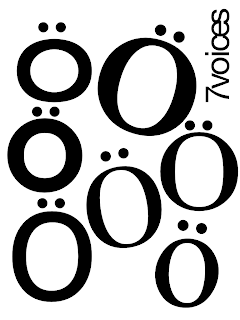
There's something I really like about the faces that are created by Os with umlauts above them. This way of thinking is almost definitely a result of my dissertation research into people like Bob Gill and Alan Fletcher, very A Smile in the Mind. Of course, if it were an anthology of seven German scriptwriters it would have been absolutely perfect. Still, no reason to throw out what is still a decent idea.
I tried another arrangement, which I do quite like but it's nowhere near as good:

My tutor Matt suggested that I could use the four typewriters that were part of an interactive exhibit at uni for the project, perhaps get some interesting results, so I went along and bashed out a bunch of different Os on each of them (I tried lower and upper-case Os as well as zeroes, plus full stops to use as umlauts). I scanned all the different bits of type in and had a bit of a play, coming up with this:

I think it's a really interesting image and I love the quality of the scanned paper texture, which was helped by a very dirty scanner (top tip to students - how about letting the ink dry before scanning one your drawings?). Anyway, my design wasn't selected, although I am considering working up the cover until it is complete, if I get the time.

No comments:
Post a Comment