Friday, 29 March 2013

Book Cover Design - 7 Voices

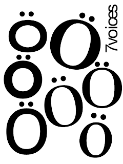
One of our tutors emailed us about a couple of book cover design projects for anthologies that have been written by MA students at Newton Park. I thought I would have a pop at the one for "7 Voices", which is an MA Scriptwriting anthology. I instantly found that I couldn't get this sort of thing out of my head:


There's something I really like about the faces that are created by Os with umlauts above them. This way of thinking is almost definitely a result of my dissertation research into people like Bob Gill and Alan Fletcher, very A Smile in the Mind. Of course, if it were an anthology of seven German scriptwriters it would have been absolutely perfect. Still, no reason to throw out what is still a decent idea.

I tried another arrangement, which I do quite like but it's nowhere near as good:


My tutor Matt suggested that I could use the four typewriters that were part of an interactive exhibit at uni for the project, perhaps get some interesting results, so I went along and bashed out a bunch of different Os on each of them (I tried lower and upper-case Os as well as zeroes, plus full stops to use as umlauts). I scanned all the different bits of type in and had a bit of a play, coming up with this:


I think it's a really interesting image and I love the quality of the scanned paper texture, which was helped by a very dirty scanner (top tip to students - how about letting the ink dry before scanning one your drawings?). Anyway, my design wasn't selected, although I am considering working up the cover until it is complete, if I get the time.

Thursday, 28 March 2013

Swearing Budgies of the World - Finished!

So I finally got the self-adhesive vinyl cut and applied it to each of my twelve budgie posters. It was a real pain to do, as the static caused them to fold or cling to my arms, and they were a nightmare to line up with the artwork. Luckily the stuff is quite forgiving and I managed to pull it off and reapply it a few times without destroying the images. It might seem a lot of bother but I think it has really added something to the project and it means that each poster is a one-off, as I am highly unlikely to go through the whole process again. I will price them accordingly when I show them at our exhibition in June.


It's not possible to get the full effect in a photo but you can definitely see where the vinyl is catching the light. All in all I am now happy with the project. However, I have always thought that as I had twelve budgies it would make sense to make a calendar. So I set to work in Indesign and made up templates, checking and double-checking all the dates for 2014. I am pretty happy with the design now and have given it to Steve to print, although he moaned about the format and said he didn't have a stapler long enough for the job (what a surprise). I am sure I can overcome.


That's the cover, which should end up printed on a thicker, glossy stock, if Steve follows my instructions. If all else fails I will pay through the nose to get a few run off at Opal or Ripe. I'd obviously rather not have to spend a bunch of money.

I had to make a little paper mock of the page layout in order to get this designed correctly, as it was a pretty weird one to get my head around in terms of spreads and how the two-sided prints would match up. Again, I left very explicit instructions with Steve, so fingers crossed...

Bath Uni - T-shirt design finalised

Nathan and I mocked up the text for the front of the t-shirts today. The Bath Uni guys decided to go for the "Actual Genius" parody of the Apple t-shirts. We decided to put this text on the front, in DIN Medium, which is the font we have used across this entire project. A small white CSCT "coffee bean" logo will go on the left sleeve.


We will screenprint a bunch of these t-shirts when the facilities reopen at uni on the 15th April. Yeah, really handy that when you have around six weeks left until final hand-in.

Tuesday, 26 March 2013

Penguin Design Award - Finished covers

I got my Raymond Chandler covers printed last week and got them put onto blank books. They look pretty good, although I am not too impressed with the really deep grooves the uni perfect binder puts into the pages. You can clearly see a sort of rippling effect on the spine, which makes them look a bit "home made" for my liking. Regardless I took them down to Mr B's where the nice chaps let me put them on the shelves to photograph:


They look pretty nice on the shelves and stand out in a good way. Maybe I should get some better quality blanks made up elsewhere, if I can afford it.

Bath Uni - Perspectives on Perspex

This week we managed to get Tim in the plastics workshop to do a few laser cut tests on Perspex. We gave him a selection of our icons, the ones we thought might cause and problem and unfortunately quite a few of them did!

We were forced to reduce the detail on quite a few of them to make them usable and we were also able to ascertain a minimum width for any element of around 5mm. With these restrictions in mind we went back over the four stencils and adjusted the symbols accordingly. We also found out how the laser cutter reads an Illustrator file - anything in a red (255,0,0) line of 0.1 to 0.25pt is cut and anything in black is etched. The etched stuff looks incredible when flipped and viewed form the smooth side, so we decided to reverse the stencil files and have our revised Centre for Sustainable Chemical Technologies "coffee bean" logo and the name for each stencil etched on the back side. I think it is going to look great.

The other thing we realised was that 6mm thick Perspex was probably going to be too heavy to use at the size we want (700mm x 400mm), so we have ordered 3mm stuff instead. We should be ready to make cut the stencils next week!

Friday, 22 March 2013

New Uni Signage

Lizzie and I spent the day with our tutors Rupert and Matt, helping them to assemble the new uni signs and stick them up all over the building. It was a long day and by the end of it my hands were properly sore. We started by taking all the printed signs and sticking them down on self-adhesive foam board, which is awesome stuff. We then had to carefully cut out each sign with a scalpel. After a very short lunch break, where we barely had time to inhale a quite nice beef balti with rice (thanks Rupert) we set about replacing the old signs throughout the building.

Here are some really exciting photos from the day:


We got paid in shop credit for the day, which will come in handy over the next few weeks. I will probably spend the majority on self-adhesive foam board so I can mount my budgies in style. Oo-er!

Staff Type Portraits

Back in the summer of 2012 I found a neat little Illustrator trick that allowed me to make some cool portraits out of type. I did a few rough ones and tiled them on A3 paper and stuck them up in the third-year's room at uni. A lot of people commented on them and many asked me how they were done, which naturally I didn't reveal.

After such positive feedback it made sense to do some proper ones and print them out at A1 size. I think they look pretty good and would certainly be impressive if they were all stuck around a single room.


Each of them is made up of a word that I thought was particularly relevant to them or what they do. Matt is upside down because he is Australian, although his word "type" is the right way up. I hope the tutors don't find them too offensive...

Thursday, 14 March 2013

Workshop - Typography with Rupert Bassett

Yesterday I spent the whole day in a typographic workshop with our semi-resident type guru Rupert Bassett. He kicked the session off by showing us his collection of corporate branding guides. There was a rather lovely big hardback for the RAC which he worked on back in the 90s. It was incredibly anal, as you might expect, with for example a whole page dedicated to showing the exact shade of white that can be used by the RAC. Similar pages set out the use of orange, blue, etc. The whole thing was beautifully put together and Rupert told us that it cost a fortune to make, as each copy required the printing of loads of spot colours and special finishes like UV varnish.

There was a fantastic slip-case that contained envelopes with style cards for each of the teams in the NFL. They looked like they were from the seventies at the very latest (I noticed the Washington Redskins logo was different to any I have ever seen) and Rupert said he picked it up really cheap at a second-hand book store in New York. The other highlight was the brilliant NASA style guide, which he was given by a friend. He said that he had subsequently been offered a "four-figure sum" for it by another designer. It is a very cool thing.

After browsing these treasures for a while, Rupert informed us that our task was to create a brand guide for the Typography Workshop that we were currently involved in. Excellent. I set to work straight away, bashing out a bunch of initial ideas:


I got a bit hung up on the whole German thing, which was really just a bit of an in-joke because it is very much Rupert's kind of thing. I rather like the one right in the middle in Comic Sans, the ironic use of which would instantly be apparent to anyone attending a typography workshop. No?

I had one more daft idea to get out of my head before I could move on:


Anyway, I then started playing around with the letter T, duplicating and flipping it to see if it could also form a W. It does to a degree and I kind of like the way that it becomes more of an abstract mark:


Here are a couple of ideas that I developed from that initial experimentation:


Rupert suggested that I should try to make the mark work in a square, which is how I came up with this:


I definitely prefer the one to the left, with the text on one line. I thought it would make sense to also make a variation on the theme, where the text sits alongside the mark.


I think I am definitely onto something. Here's an example of the two variations working with a few different colours:


I am not sure whether to take this project any further at the moment. It would be nice to create an entire branding guide for the Typography Workshop but I am not sure I will have the time. If I were to do it I would want to cover at least the following:
  • Typography guide
  • Colour palette (TW Blue, TW Red, etc, with Pantone refs, CMYK, RGB and Web)
  • Grid structure
  • Photography usage guide
  • Logotype usage guide (showing correct and incorrect usage examples)
  • Poster design guide (A0, A1, A2, A3, A4 - show example posters of dream guest speakers)
  • Billboard design guide
  • Screen use
  • Advertising
  • Website
  • Letterhead
  • iPad
  • Business card
  • Uniform (staff and students)
I'll leave it there for the time being. However, here are a couple of poster ideas I came up with:

Saturday, 9 March 2013

Bath Uni - A visit to a science fair

Today I popped down to Green Park Station to take a look at the annual Bath Taps Into Science event. I wanted to see how these things were presented and thought it might be nice to catch up with some of the Bath Uni people.


First impressions were that it is very busy, each exhibit only has a tiny amount of space in which to work and that the use of Comic Sans was abundant! I can certainly see why Bath Uni were keen on getting us involved. The whole thing looked very Blue Peter, which, in a weird way, was part of it's charm. I introduced myself to the guys from Bath Uni - they didn't seem to be aware of the collaboration as they were first years and we are dealing with third years and above. Funnily enough it is actually these very first years that will be taking our designs to Cheltenham Science Festival!

I was slightly perturbed to see these crudely designed posters:


Why were we not aware of these? They will obviously have to be redesigned to keep them inline with our new branding. I have contacted Bath Uni to get hold of the files. One of the guys on the stand mentioned that the laminated sheets were printed on both sides and that no-one actually ever turned them over. I will bear this in mind with the redesign.

Friday, 8 March 2013

Careers Seminar

Last night we were invited to attend a careers seminar in the lecture theatre. There were four speakers in total; Tim Jones from Ignition Strategic Design, Rich Milton from Brand in a Box, Sam Dyer from The House and Bob Abbott from Future Publishing.

First to speak was Tim Jones, who had the menacing corporate air of a Bond villain (think Christopher Walken in A View To A Kill). It was immediately clear that he is not a designer and never has been. He talked about "going forward", "the extra mile", "design as a product" and "the big guys". He is exactly the type of person that I will never work for or with. It was not surprising when he said that he "came in through sales". Used car sales most likely. Moving swiftly on...

Rich Milton seemed more like a real human being. He works for Brand in a Box, a company that makes eco-friendly packaging for sandwiches. The packaging looks pretty classy, sort of like Pret A Manger, and he told us about how people "eat with their eyes". I wish he demonstrated this live for our amusement, especially if he used an extra crispy BLT. But as our first speaker might say, "lunch is for losers"...

Sam Dyer was introduced mere seconds before Rich Milton lost the room completely. Then there was a technical hitch with his presentation and the room was lost completely. In stepped Future's Bob Abbott, whose face was vaguely familiar from when I served my time there (1998-2002). His delivery was hip and down with the kids, as is the Future way, and he even dropped in the occasional swear. To be fair to him he seemed like a decent sort and he wasn't born in a suit; he started out as a designer before becoming editor of Computer Arts. He talked about how a typical magazine team at Future was a passionate bunch, who loved their subject and loved making great publications. This was certainly true when I started at Future in 1998, although everything changed when the company floated on the stock market in 1999. It is now a top-heavy corporation that churns out sub-standard product for an ever-dwindling readership, with no room for anything as unquantifiable as "passion". Where do you put that in a spreadsheet?

/rant

Anyway, after assuring us that Future was still a very cool place to work, "like uni but you get paid", he told us that design is not shit, which most of us already knew, and that percentages were something that you had to talk about a lot in business. Thanks Bob! See you down the pub later?

Finally Sam Dyer took to the mic and nervously informed us that he didn't like public speaking. Finally, a human! Sam is actually a designer, a fellow creative who works for a branding agency in Bath called The House. He showed some examples of his work, most of which was really nice and also very clever in true A Smile In The Mind style (use of negative space, visual puns, etc). It came as no surprise to hear that he cut his teeth at The Partners - the huge London agency that was co-founded by A Smile In The Mind author David Stuart. He was not in any way brash or cocky, despite being an obviously talented and successful designer. And he didn't do anything that followed the current hipster trends, which was very refreshing. It's also probably why we never had him as one of our usual guest lecturers!

Sam gave us a lot of practical advice - work hard, do work placements, research the companies you want to work for and do the kind of work you know they will like. He also said to not bother emailing him or writing a letter as it's just too easy to ignore. No, if you want to get anywhere you need to pick up the phone and call. I am not too happy doing this but I also can't imagine that Sam is either. Sometimes you just gotta suck it up. The person on the other end of the phone is after all a human being too. Unless of course it is Tim Jones.
Monday, 4 March 2013

Project Idea - Autism awareness leaflet

Since back in the summer I have been thinking about doing a project to raise awareness of Autism Spectrum Disorders, more specifically to help new parents spot the signs and get an early diagnosis and the necessary support. We first suspected that my son Arthur had ASD because his speech development was significantly delayed. Also, he had a tendency to line up all his toy cars:


With this in mind, I had the idea of creating a concertina leaflet that featured a simple single-line drawing of a row of cars, buses, trucks and bikes, all the way across the front and back. Dotted above and beyond the line at regular intervals would be things to look out for in your child. The final piece of information would be about the tendency to line up toys, revealing the thought behind the visual.

It's a pretty raw idea at the moment and it would not be a substantial project, so maybe it's one I will come back to if I have time after all my other work is complete.

Lecture Poster - James Jarvis

Here's the poster I did for the James Jarvis lecture:


I took a hand-rendered approach to this one, I think because I enjoyed painting the big cock on the Neil Drabble poster. There's something nice about a mix of printed and hand-rendered. Possibly an area I could explore in the future. At the bottom it says "Go and look at him in the lecture theatre from 5pm".

I like writing stuff exactly as I see it. I think it humanises a piece of communication. Also, most people do just sit there and stare at the speaker, especially if it is someone hip who they all want to emulate and idolise. I didn't go to the lecture as his stuff isn't really my kind of thing. Turns out I made the right choice as it went on for over an hour and a half, mainly of him showing slides of his instagram photos. Exciting.

Friday, 1 March 2013

Project Idea - Hot food comes to Cafe Sion

The big news this year at Sion Hill is that we finally have a daily hot food option! In general the food is actually okay and costs no more than one of the crappy sandwich. Service with a smile is still obviously not an option though. I was thinking it might be an idea to do a small publication or app that celebrates this breakthrough - I banged on about a lack of hot meals in every student rep meeting in the first and second year, along with the provision to pay by card (this has happened too).

It's just an idea at this stage, but I have been photographing my meals for a while just in case I want to go ahead with a little project. It's quite good fun looking back at the food and trying to identify what it was:


I think that one was okay, despite being vegetarian, although it was a bit heavy on courgette. On a Monday we don't get a regular hot meal, instead there is the option of "pasta machine", which the lovely ladies of Cafe Sion are still struggling to get to grips with. It's basically quick-cook penne pasta with a choice of vegetable or meatball ragu for £1.80, which to be fair is reasonable. However, the vege option seems to be just the carnivore version sans-meatball, yet for the same price! Also, we have found that the number of meatballs varies considerably - from a mighty six to as few as two.